How to Write Lowercase Calligraphy Letters [Alphabet]
Learn how to write lowercase calligraphy letters with our do's and don'ts video tutorial!
Step by step, we'll show you how to write 'a' in calligraphy plus the rest of the alphabet with our do's and don'ts video tutorial.
We have gotten a lot of questions from beginners on how to improve their lettering, especially their consistency. So we decided to compile our best tips here!
An important note... There is no "correct" or "wrong" way to do brush pen lettering. Our goal is to teach you the fundamentals through specific examples of "do's and dont's" so that you can make your lettering more consistent.
Table of Contents
Pause now to pin for later! ↓
Many Calligraphy Alphabets
What we now know as the Latin alphabet was “invented” in ancient Rome and people have been creating new alphabets ever since.
There are many different styles of calligraphy alphabets and at Loveleigh Loops we believe that each one is worth learning!
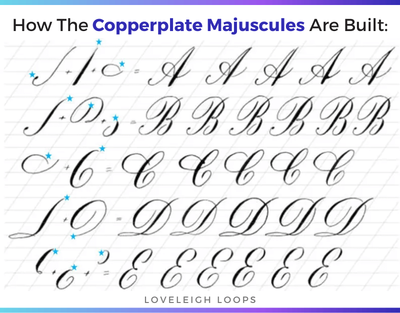
Example of the capital calligraphy letters from our Copperplate calligraphy workbook
Just to name a few calligraphy styles:
Copperplate: The ever-elegant Copperplate script is done with dip pen (also called a pointed pen) and has been one of our favorites for years.
Spencerian: Although it’s a traditional script, Spencerian looks amazing when used with digital art (try for yourself here with a free iPad Spencerian worksheet)
Brush pen: Often referred to as modern calligraphy, brush pen lettering is another term for this colorful collection of modern styles
Bounce lettering: With bounce lettering, you get to break many of the rules to create your own alphabets with truly unique calligraphy letters
This is just the tip of the iceberg! While you can experiment endlessly with ending strokes and flourishes, at the heart of all of these calligraphy alphabets are the same pen movements.
We call those individual strokes the basic strokes of calligraphy. Let’s look a little more closely at them before starting on your calligraphy alphabet.
You may also like: How To Write “Thank You” In Calligraphy
The Basic Strokes
When you write any letter in calligraphy, you don't use a continuous motion like you would in cursive writing. Instead when you create letters in calligraphy, you lift the pen after every stroke.
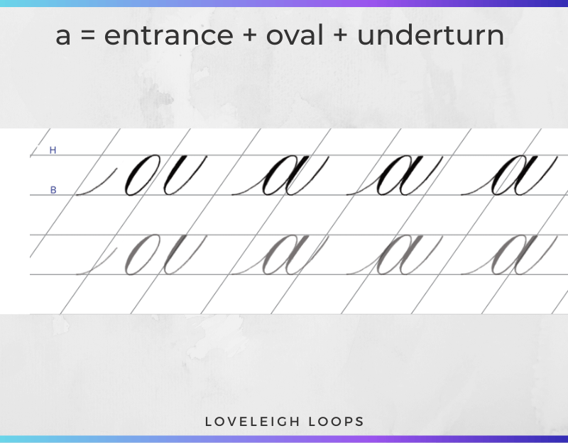
Let's look at the Copperplate alphabet and look at one of the letters, the letter 'a' in more detail.
From our Copperplate alphabet tutorial
The letter 'a' is made using three different strokes: an entrance stroke, an oval and an underturn.
Every stroke stays nicely between the baseline and header line and doesn't reach the descender line or ascender line.
Thick And Thin Lines
When you look more closely at the oval shape, you can see that lines are not of equal thickness. In fact every time the pen moves down, you see a thicker stroke.
To create this contrast, Calligraphers use specific tools such as a dip pen or brush pen. By applying pressure when the pen moves towards you, you can create the thick and thin lines that turn writing into calligraphy.
Learning pressure control is one of the hardest calligraphy skills and it takes time and practice to master.
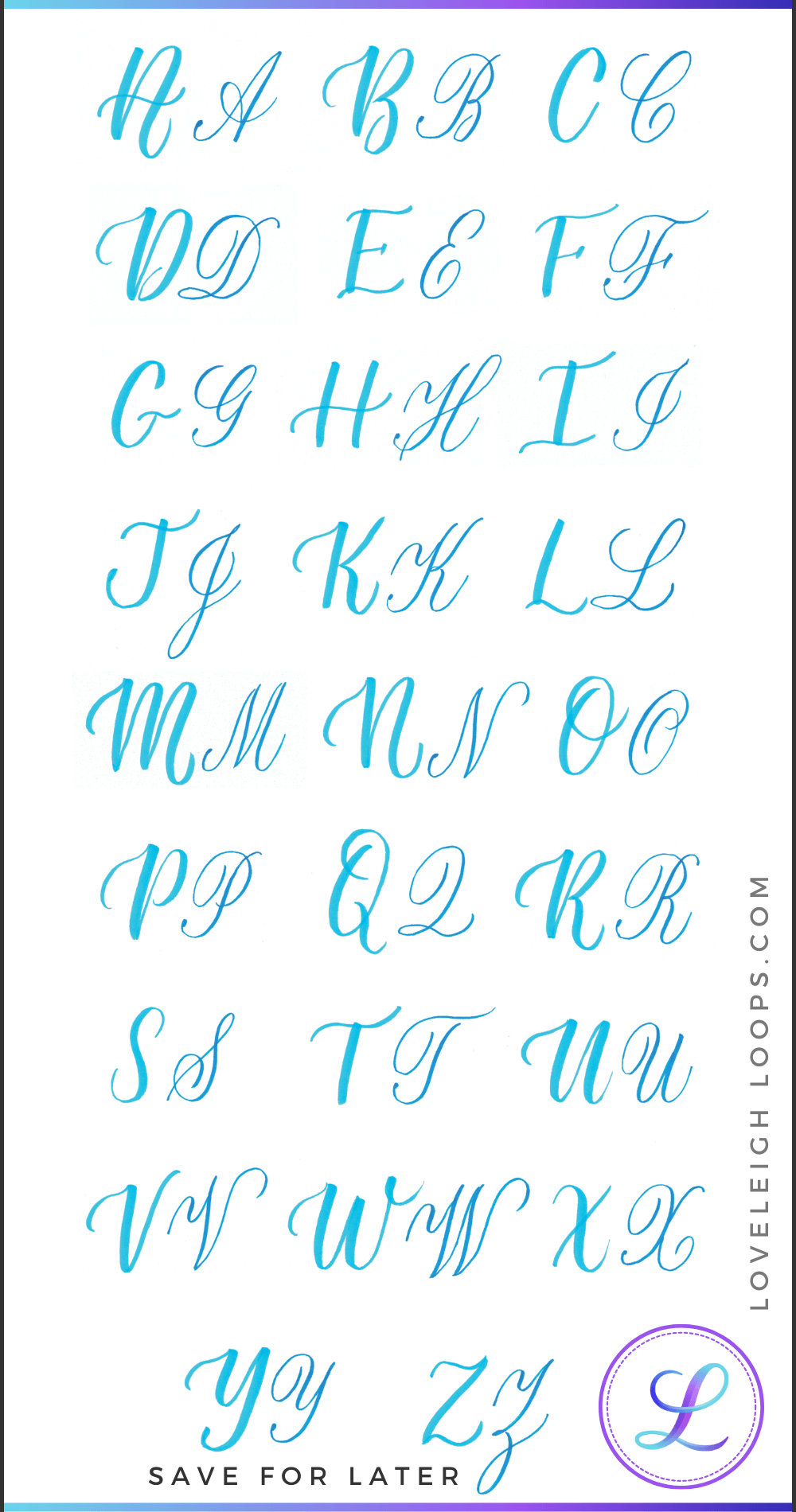
See the varying thickness of each calligraphy letter? This is an example of modern calligraphy
Practicing The Lowercase Alphabet
It won't take long before you can move on from practicing the basic strokes to practicing words and letters as long as you have the right mindset.
When you start practicing, it's very important to realize that calligraphy isn't about speed. Instead, the goal is consistency and perfection and it can take you as long as you need.
When you're practicing, aim for consistency in:
Height: Have your letters fit nicely within the x-height
Stemloops: Any loops should be equal in height as well as width
Shading: Make sure your shading has the same thickness for every stroke
Slant: Many calligraphy styles are written at a specific slanted angle. Keep the angles the same
At Loveleigh Loops, we recommend downloading and using one of our free practice sheets as you learn. You can find 20+ free worksheets inside our practice sheet library!
Tips For Writing Lowercase Letters
How to write the lowercase letters in calligraphy:
Lowercase A in calligraphy: The body of the letter should be an oval rather than a c-shape. The shaded strokes are parallel to each other and are angled to the baseline.
Lowercase B in calligraphy: Lift after every stroke. The main shade should be flat, not curved. The exit stroke has a shade that is parallel to the main shade of the letter.
Lowercase C in calligraphy: The entrance stroke should connect smoothly and not too low on the body of the letter. Finish the shape with a slight shade (or filled-in circle) on the right side of the letter for balance.
Lowercase D in calligraphy: Similar to "a", the body of the letter should be an oval rather than a c-shape. The shaded stem only overlaps a small segment of the oval's hairline to leave a triangular shaped gap.
Lowercase E in calligraphy: The placement of the shading is important in this letter. The small loop is a hairline and does not start too low on the body of the e. The main shade is parallel to the slant and does not curve inward, so that the letter is not bottom heavy. The body of the letter should be a partial oval.
Lowercase F in calligraphy: the backbone of the letter should be straight and parallel to the main slant of the script, not C-shaped. And as always, lift the pen after the entrance stroke.
Lowercase G in calligraphy: the body of the letter should be a symmetrical oval. The shade of the oval and the shade of the descending stem loop are parallel. Lift the pen after each stroke.
Lowercase H in calligraphy: the backbone of the letter should be straight and parallel to the main slant of the script, not C-shaped. The stem and the shade of the compound curve are parallel.
Lowercase I in calligraphy: the entrance stroke connects to the letter smoothly and not too low. The bottom is a curved U-shape, not a pointy V-shape.
Lowercase J in calligraphy: the descending stem loop is not too narrow, not too wide. Both of our names start with J! Anyone else?
Lowercase K in calligraphy: the backbone of the letter should be straight and parallel to the main slant of the script, not C-shaped. The stem and the shade of the curves are parallel.
Lowercase L in calligraphy: the ascending stem loop shade should be straight and parallel to the main slant of the script, not C-shaped. Lift after the entrance stroke.
Lowercase M in calligraphy: the two "humps" of the letter begin at the baseline rather than connecting at the top of the downstrokes. Starting lower will create a larger triangle-shaped gap between the curves.
Lowercase N in calligraphy: start with an overturn. The compound curve begins at the baseline - it does not connect horizontally to the first down stroke.
Lowercase O in calligraphy: entrance stroke connects smoothly to oval. Oval transitions from thin to thick at the top, it does not start as a thick stroke. Exit stroke shade is parallel to shade of oval.
Lowercase P in calligraphy: the stem is at an angle to the baseline and the rounded section is an oval rather than a backwards c-shape.
Lowercase Q in calligraphy: the stem intersects the right side of the oval but does not overlap it. The round section is an oval so that the triangular shaped gaps on the top and bottom are symmetrical to the shade of the oval.
Lowercase R in calligraphy: the loop extends above the header line and is the highest point of the letter. After forming the loop, continue downward (not up) to lead into the underturn shape.
Lowercase S in calligraphy: the shade at the top is parallel to the slant and balances out the letter so it is not bottom heavy.
Lowercase T in calligraphy: the entrance stroke stops at the header line, it does not extend to the top of the letter.
Lowercase U in calligraphy: the upstroke of the first u shape goes up to the header line, which creates a triangle shaped gap.
Lowercase V in calligraphy: the shaded down stroke is parallel to the upstrokes.
Lowercase W in calligraphy: similar to lowercase V, the shaded down strokes are parallel to the upstrokes.
Lowercase X in calligraphy: do not cross two thick strokes.
Lowercase Y in calligraphy: strokes are parallel. First stroke is a compound curve. Lift after each stroke.
Lowercase Z in calligraphy: descending loop does not go above the baseline.
If you're interested in learning calligraphy then check out our blog post on basic calligraphy. where you'll find lots of helpful information as well as clear instructions on how to take your hand lettering to the next level!
We created an instant download of the lowercase alphabet if you prefer tracing the letters as you learn.
Our Beginner Calligraphy Workbook works best with a small brush pen like the Tombow Fudenosuke.
What’s Next?
If you want to move beyond the free worksheets and follow a step-by-step calligraphy alphabet workbook, consider downloading our workbook now for instant access:
Our 5-star Copperplate workbook
Ready to learn more? Take our free online calligraphy course.
Our most popular class gives you worksheets and step-by-step videos to teach even the newest letterer how to do calligraphy. You can get started TODAY with a regular pen and paper. No fancy tools needed. Start today.


