60 A-Z Calligraphy Alphabet Examples (+ Free Worksheets!)
The calligraphy alphabet can take almost any form. Traditional calligraphy letters have had their same form practiced for centuries, and modern calligraphy letters see constant development and experimentation.
When the Latin alphabet originated in ancient Rome, the Romans probably never imagined the beautiful, creative alphabets that would come to be! While we don't use the exact same reed or quills that they wrote calligraphy with in ancient Rome, many calligraphers today still replicate traditional styles with a pointed pen or broad edge pen. More modern tools are even easier to use and practice writing with.
Let's dive in with our calligraphy alphabet guide, where we'll explore:
Traditional alphabets, such as Copperplate, Spencerian and Blackletter
Modern calligraphy alphabets, such as bounce lettering, brush lettering and hand lettering
Plus examples of digital calligraphy alphabets that span ALL styles
Let these calligraphy alphabet examples inspire you to practice writing, create your own alphabets or even create your own calligraphy font!
Table of Contents
How Do You Write The Alphabet In Calligraphy?
Despite similar appearances, writing calligraphy letters is very different from handwriting such as cursive.
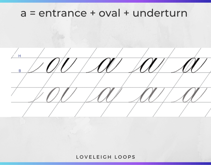
In cursive, letters are drawn without lifting the pen whereas in calligraphy you create letters one stroke at a time. For example, the lowercase letter a in calligraphy is written using a combination of 3 basic strokes; the entrance, oval and underturn.
Creating Your Own Alphabets
While traditional calligraphy letters adhere to strict rules, modern calligraphers can create their own calligraphy alphabets exploring different styles.
Answer these "this or that" questiopns to help you identify what elements you want to include in your own calligraphy alphabet:
Traditional or modern calligraphy
Ornate or minimalist
Flat or 3D
Standard letterforms or unique letterforms
Did you know you can even create your own calligraphy font based on your own handwriting?! Let's quickly look at how.
Turn Your Alphabet Into A Calligraphy Font
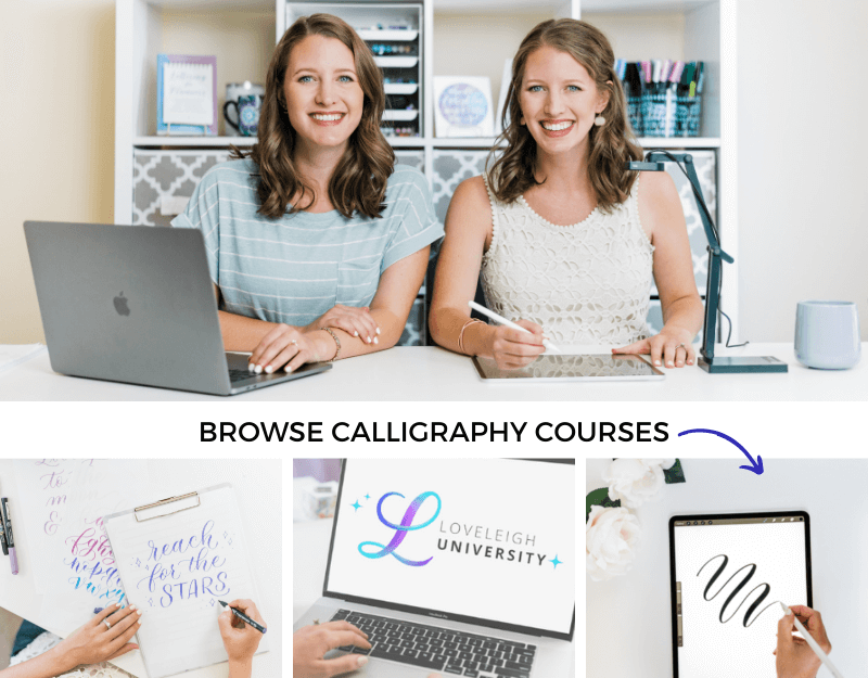
All of the calligraphy alphabets below are handwritten, either by us (Jillian and Jordan, hi!!) or by the calligraphers in our online community. We've included the name of each calligrapher along with their alphabet submission (how talented are they?!).
Accompanying many of the examples, you'll see links to calligraphy fonts that are similar to each alphabet style. Those fonts are close matches to the alphabet styles, and aren't exact replicas of the letters you see.
However, it IS possible to make whatever font you'd like by turning your own calligraphy or hand lettering into a calligraphy font! If you're inspired enough today you can try font making for free with the font generator FontStruct.
But the BEST resource (by far) for creating fonts is Learn Font Making Course by Every Tuesday. After Jillian took the course, she made her own calligraphy font and loved it so much, she is now an affiliate for it. Check it out if you want to learn the process and make your own! Okay, back to the alphabets…
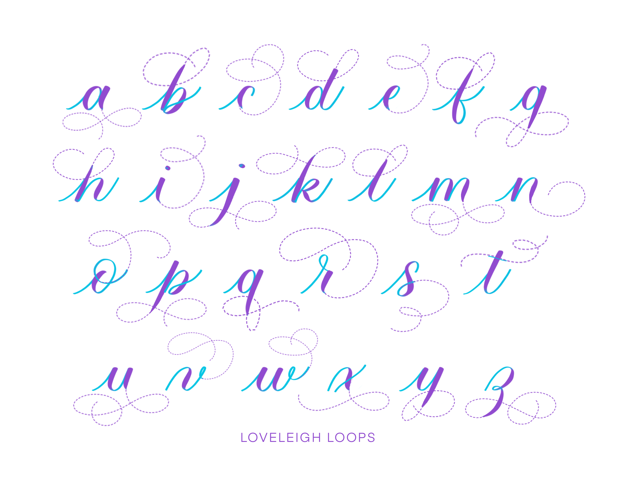
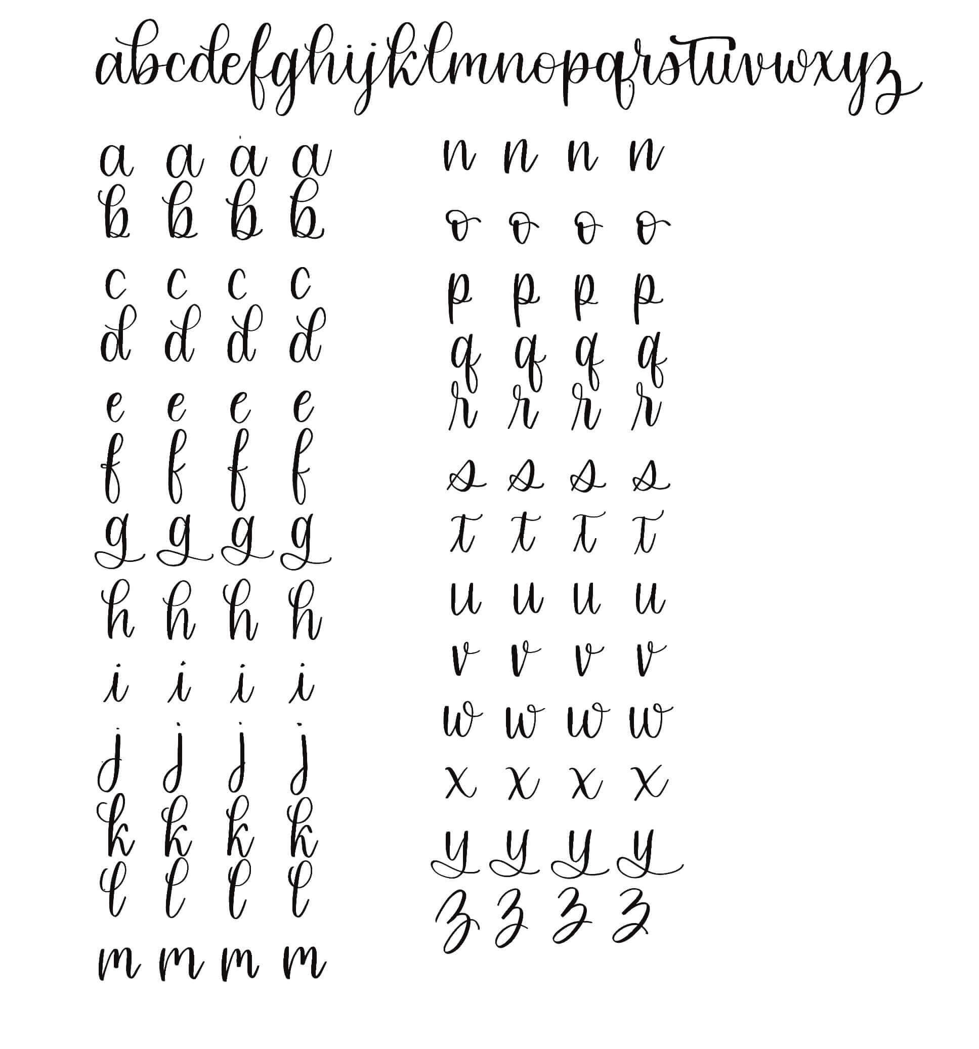
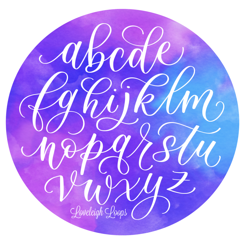
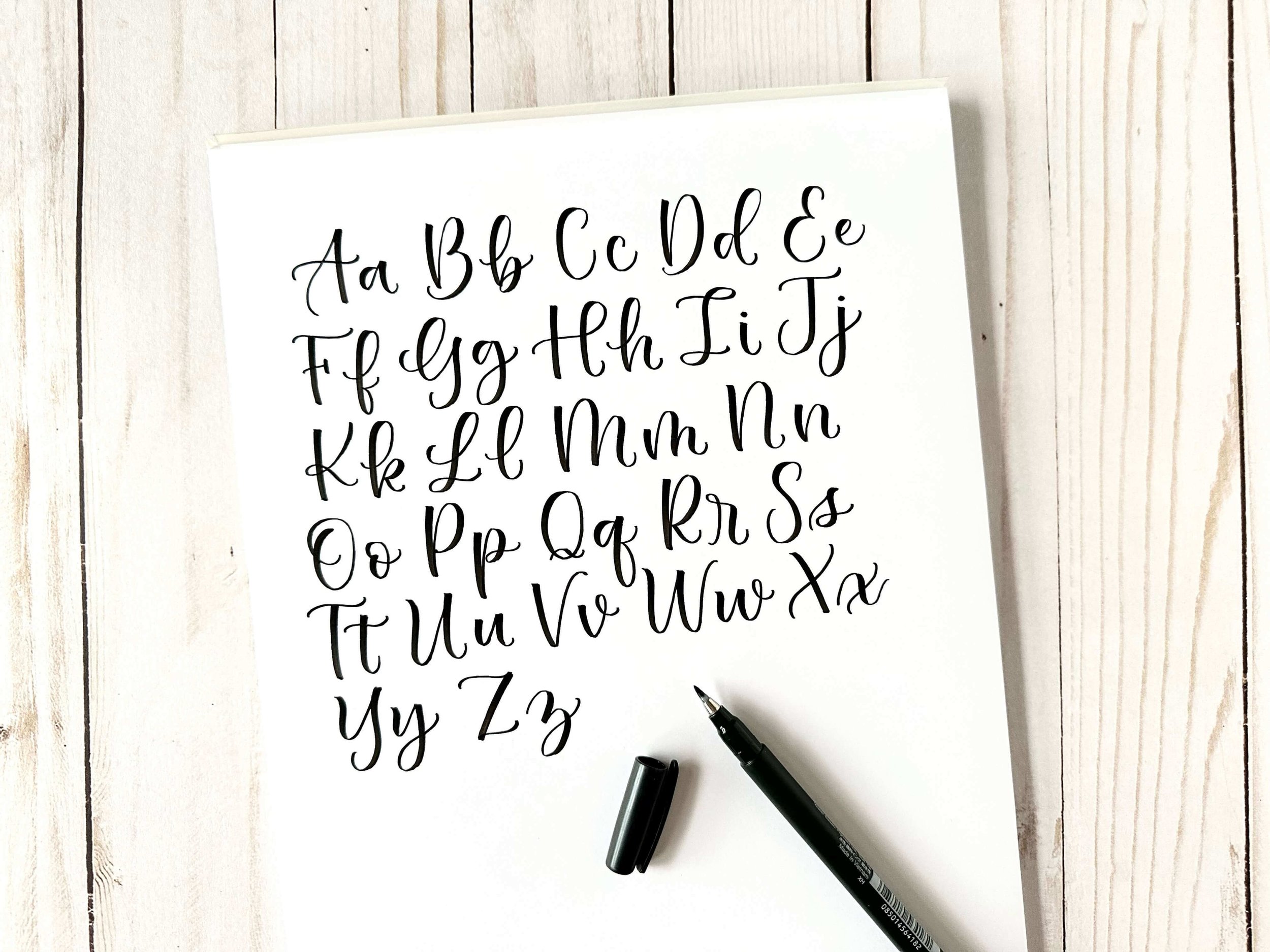
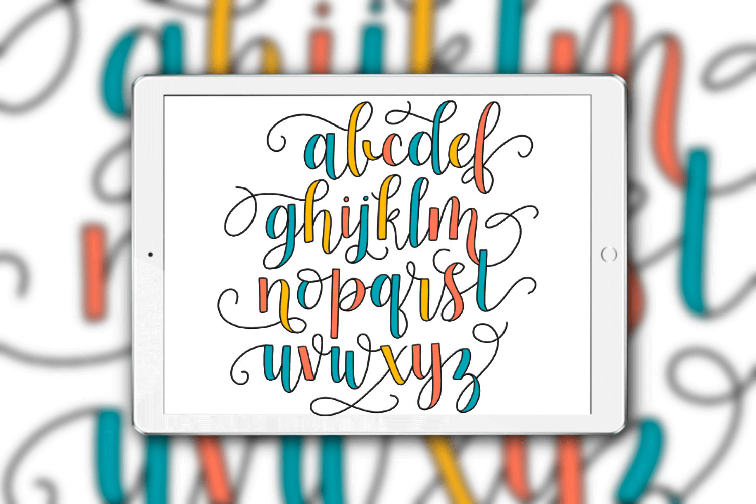
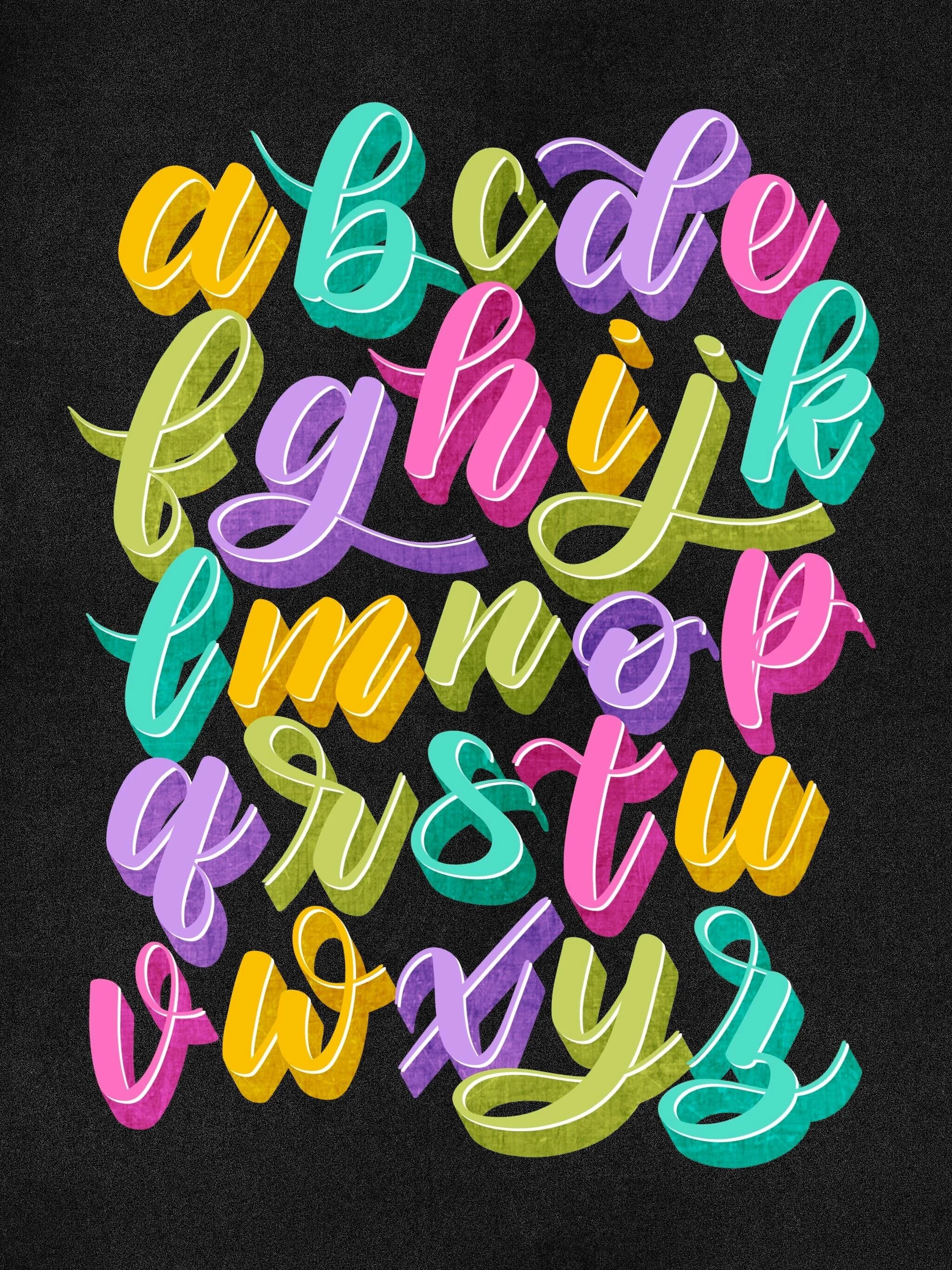
The flourished calligraphy alphabet writtten on the iPad by Jordan (Loveleigh Loops)
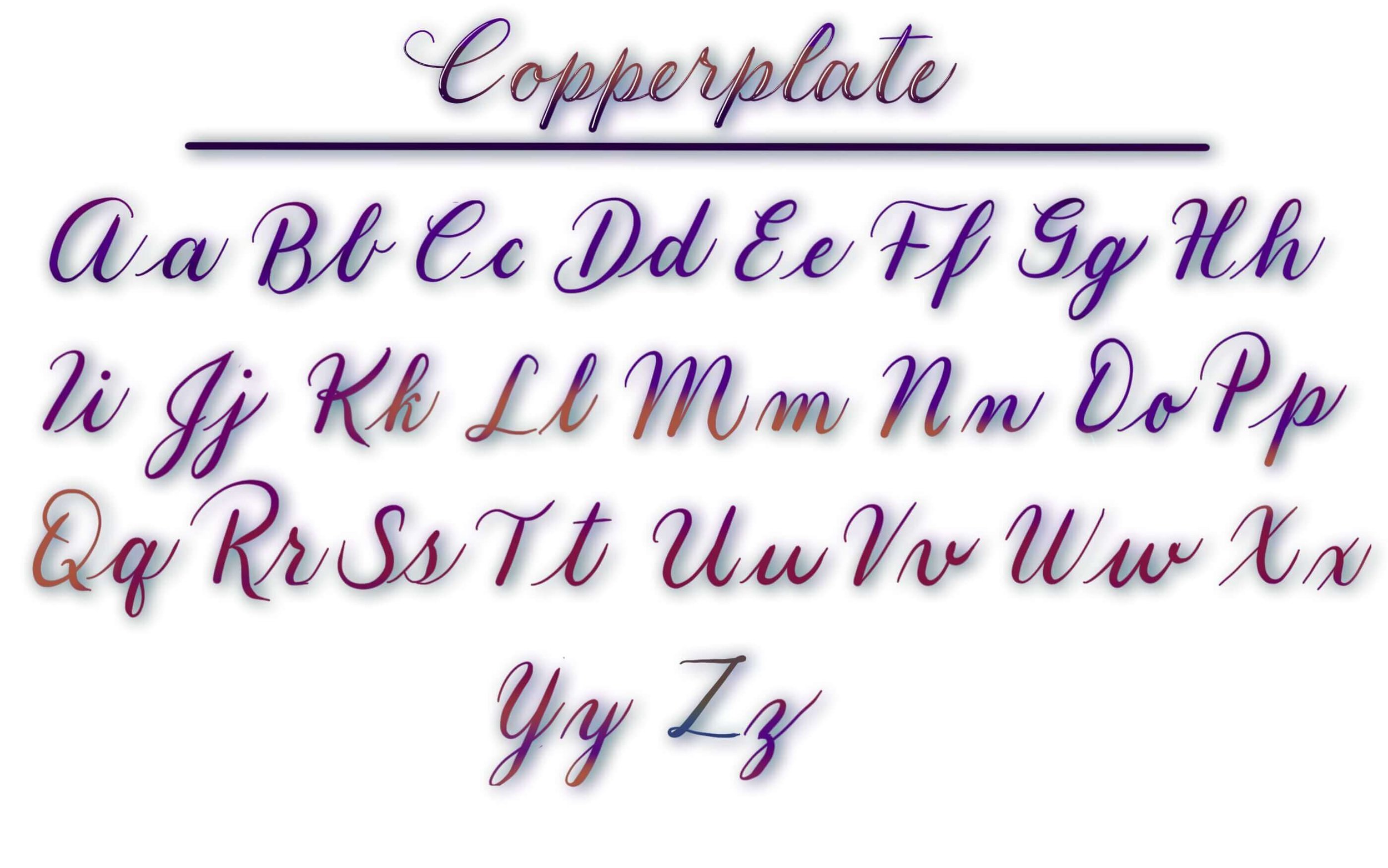
Copperplate Calligraphy Alphabets
Let's start our series of alphabets with those drawn in traditional calligraphy styles. Calligraphy is an ancient art form and learning the traditional scripts is still extremely popular today. We're going to start one of the most popular traditional scripts: Copperplate calligraphy.
This script, like most traditional scripts, is written with a dip pen (also called a pointed pen). You can learn all about this special calligraphy utensil in our beginner's guide: How To Use A Calligraphy Pen.
To try this calligraphy alphabet for yourself, download our free Copperplate lowercase stroke worksheet!

Jordan writing with a pointed pen
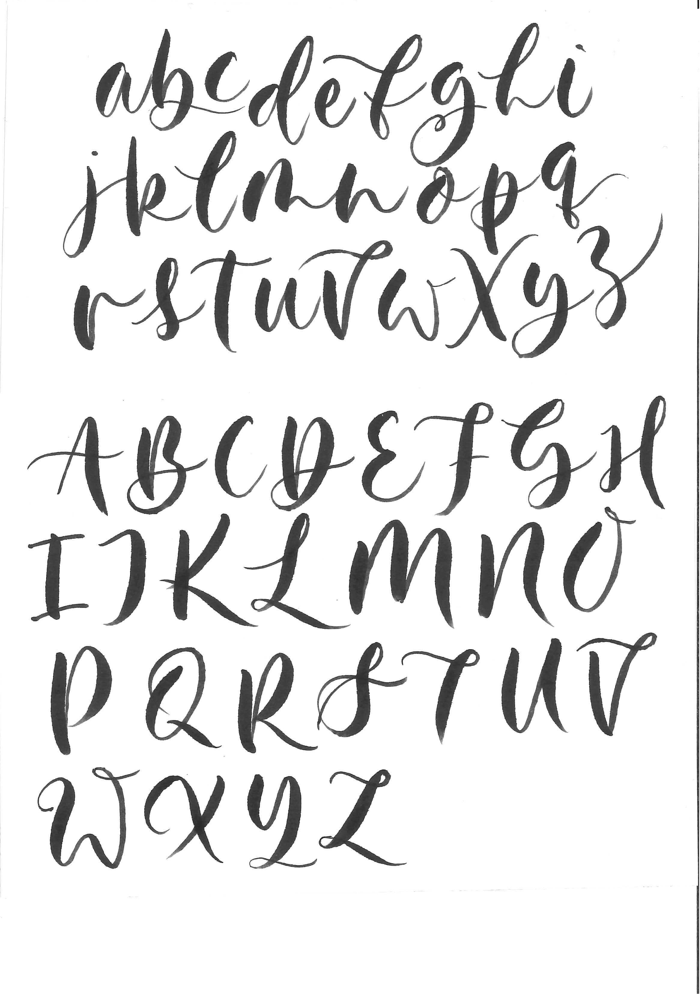
1. Standard Lowercase Copperplate
Look closely at this script's letters below and you'll see that letters aren't drawn at a uniform width: letters are drawn with both thick and thin lines. The thickest part of the letter is referred to as the downstroke or shade.
A few fundamentals about this calligraphy alphabet:
Each letter is drawn at a 55-degree angle
You don't write words in one motion: you write them stroke by stroke, lifting multiple times per letter, and there are 8 basic strokes total
Thin lines are drawn when your utensil move upwards, thick lines are drawn when you move downwards and apply pressure
The slant at which this script is drawn can give the feeling of elegance.
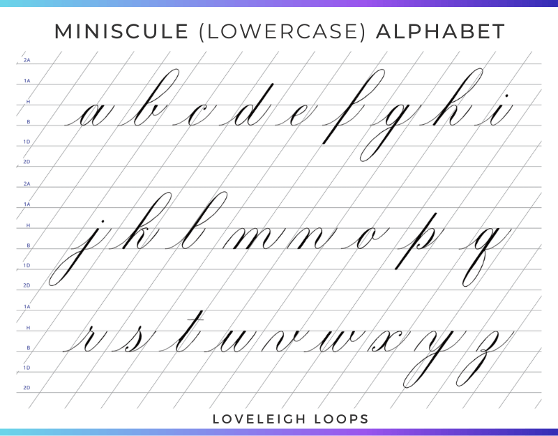
Written by Jordan (Loveleigh Loops)
👉 Tutorial: How To Write The Copperplate Lowercase Alphabet
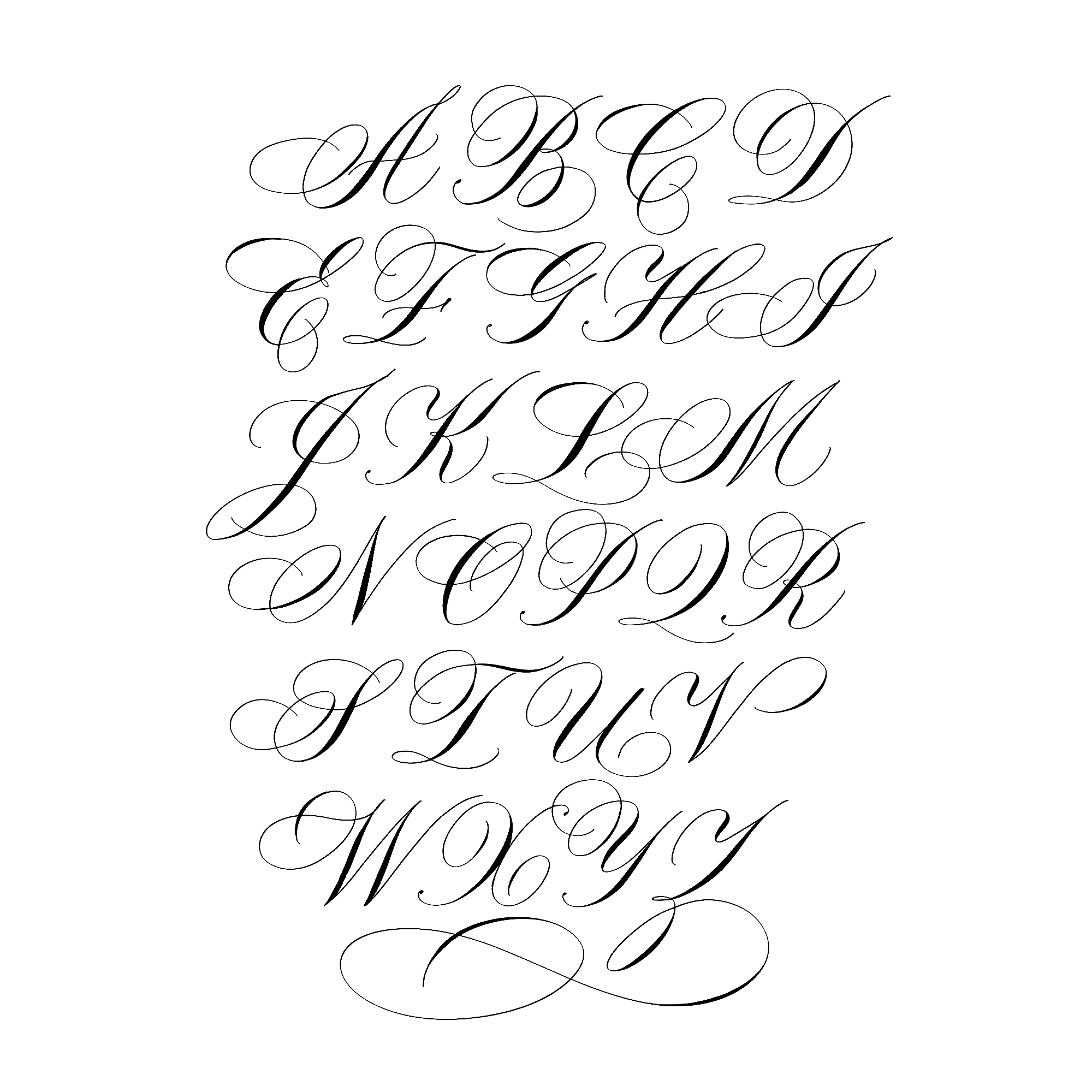
2. Standard Uppercase Copperplate
The letters of this alphabet can go by the name uppercase, capitals or majuscules. These terms are all synonymous (this goes for all styles of the calligraphy alphabet, not just Copperplate!).
A key difference between the lowercase letters and the uppercase letters is the number of basic strokes that words are built from. The Copperplate majuscules are built from 5 basic strokes, instead of 8.
You can start practicing the strokes now with our free capital stem worksheet.

Written by Jordan (Loveleigh Loops)
👉 Tutorial: Copperplate Capital Letters
3. Copperplate Flourished Capitals 1
Do these letters feel fancier than the previous calligraphy alphabets? The collection of capitals above is the basic version of the capital letters. The letters here are embellished with calligraphy flourishes.
Flourishes are extensions and embellishments of strokes, giving letters a more grandiose appearance. You'll often find flourishes on wedding invitations and event place cards. Seeing these elegant lines and fancy swirls explains why Copperplate remains a popular script with us and our students!
Written by Jordan (Loveleigh Loops)
👉 Tutorial: Copperplate Flourishes For Beginners
4. Flourished Copperplate Capitals 2
You'll notice that we have several Copperplate calligraphy alphabets that are flourished, and they all look different. That's allowed—encouraged, in fact! Traditional calligraphy relies on structure and consistency, but flourishes allow each calligrapher to break the mold and express their individual style.
Truth be told, you can do that anytime, anywhere in your lettering; flourishes just so happen to be a great place to let your creativity shine. You can try your hand at calligraphy flourishing using our free flourishes worksheet.
This calligrapher, Rancy Wang, chose delicate and detailed flourishes, providing a great deal of detail in this calligraphy alphabet.

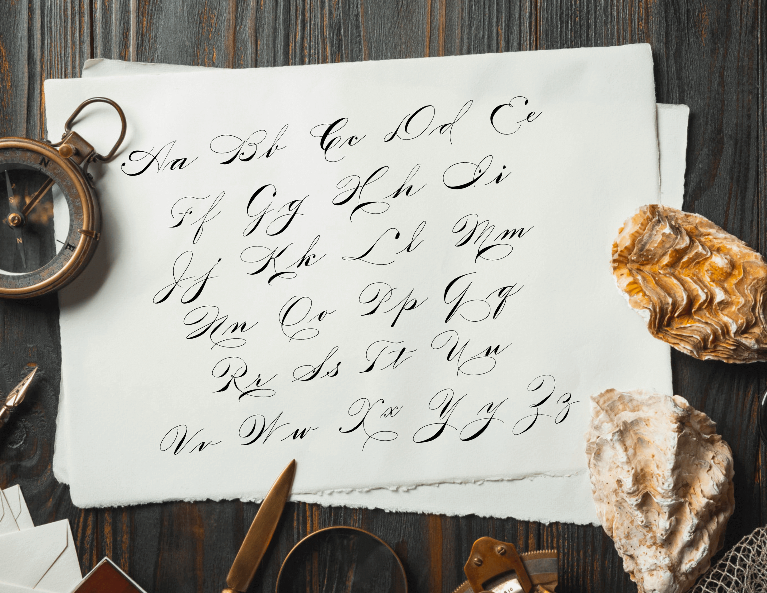
5. Flourished Complete Copperplate Alphabet 1
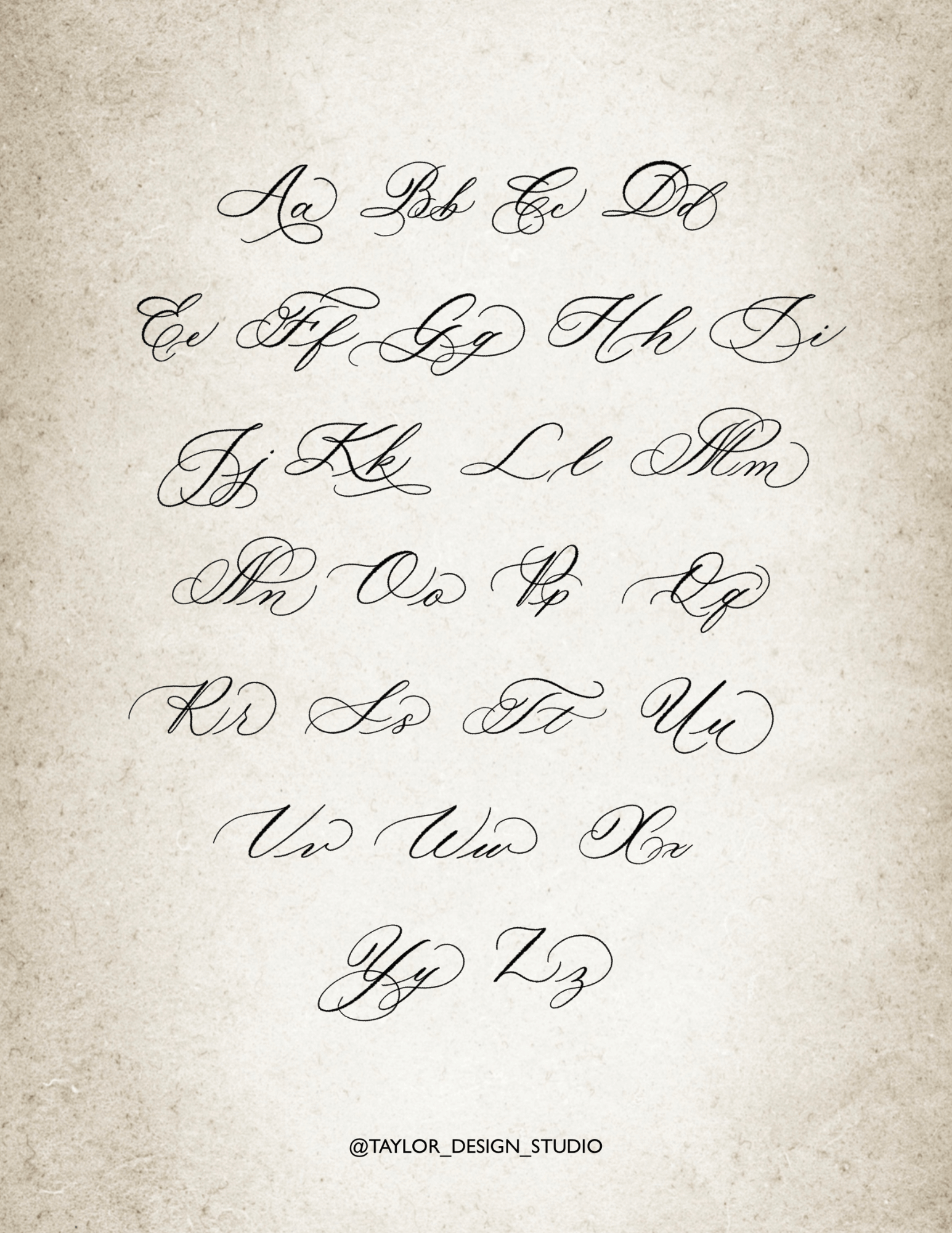
This beautifully flourished alphabet by Sophie Taylor of Taylor Design Studio has a more slanted style than the previous calligraphy alphabets. It has a predominantly Copperplate style with a few modern elements, and is written on the iPad using the Procreate App.
Look closely and you'll see some beautiful detailing: the lowercase letters and capital letters sometimes have flourishes that intertwine. You may be wondering, is that even allowed?!
The answer is yes! There are very few hard rules to flourishing, aside from the principle that flourishes should not reduce the legibility of a composition.
You may also like: How To Write “Thank You” In Calligraphy
6. Flourished Copperplate Letters 2
Can you identify any differences between this alphabet and the previous three? This alphabet by Nikki Davis has smaller flourishes that are more open and free rather than crossing back over themselves.
If you're interested in learning more about flourish shape, we demonstrated some basic flourish formulas on our Instagram account.
Something else that’s special about these calligraphy alphabet letters is the expressive exit strokes that each letter ends with. This style is rooted in traditional calligraphy but has modern expression and we think it is absolutely stunning.
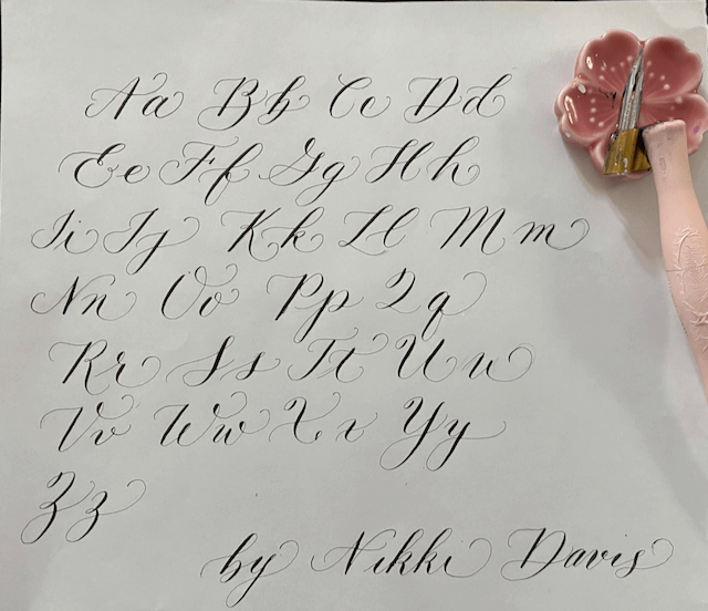
Submitted by Nikki Davis
7. Copperplate With Flourishes 3
This calligrapher, Raymond, has a graceful and elegant style that feels timeless. He took time to write words as well as individual letters, and it adds a lot of dimension to the alphabet example. Note the small dots that are drawn on our names "Jillian & Jordan." (Thanks, Raymond—we love it!)
The control and precision that this calligrapher brought to their alphabet style is inspiring! It's also the first example of a calligraphy alphabet being written in colorful ink.
While all of the past calligraphy alphabets are similar, they all have distinctive creative differences that showcase each calligrapher's personal style.

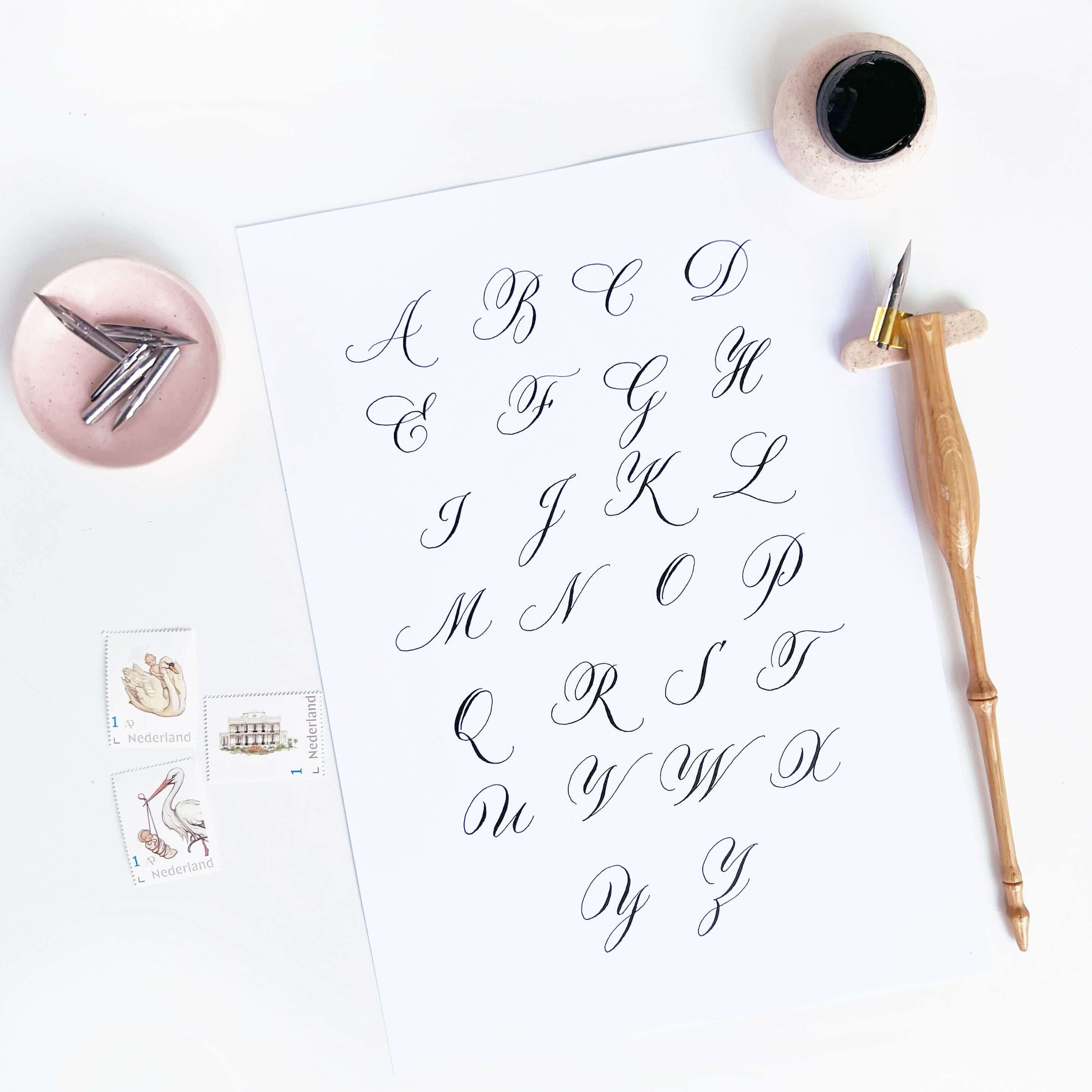
8. Beautiful Copperplate Majuscules
Let’s round out the Copperplate category with this gorgeous pointed pen calligraphy alphabet exemplar courtesy of Sylvia van Dijk.
Her timeless letters exude luxury and showcase the calligrapher's talent. She has embedded her unique style into these letterforms such as the dipped K and R. And check out the stunning Q!
Digital Copperplate Calligraphy Alphabets
Traditional calligraphy scripts can actually be created using modern tools, like the iPad! Here's a glimpse of this traditional script written in the Procreate App on with an Apple Pencil.
9. Digital Copperplate Exemplar
This calligraphy alphabet by Aileen beautifully showcases both the capital and lowercase letters using an Apple Pencil, iPad and the Procreate App.
Something that makes this one extra special is the delicate 3D detailing added to the word "Copperplate" and the blended colors within the alphabet letters.
👉 Tutorial: How To Blend In Procreate
10. iPad Copperplate Letters 2
Here's another digital alphabet example, and this time the calligrapher, Suzy, made this alphabet a part of a larger composition. She made a beautiful pattern using alternating colors, and contrasted their alphabet letters against a patterned background. Well done, Suzy.
This calligrapher used the Loveleigh Brush for both the scripts and the background florals.

Want to try typing in the Copperplate alphabet? Try the Copperplate Script™ font by CastleType.
Traditional Inspired Calligraphy Alphabets
There's so much to say about these traditional letters! What makes the following alphabet really special is the style combinations that the calligrapher created.
11. Modern Copperplate Lowercase Letters
The base of this style is Copperplate, but Sarah brought so much flare into this calligraphy. The fluid and expressive nature of this alphabet moves it close to the realm of modern calligraphy in our book.
Did you notice how the flourishes fill in the negative space beautifully? This takes an incredible amount of planning and practice. Explore composition decisions in our calligraphy layout and composition guide.
Submitted by Sarah Clyde
12. Circular Copperplate Alphabet
Instead of the normal straight baseline (the line that you write on), Sylvia has drawn a round baseline and created a truly unique alphabet. It takes an incredible amount of precision and control to achieve this effect while maintaining even spacing and sizing.
Beyond the round form, something else that makes this calligraphy alphabet unique is the flourishes both above and below the x-height (the height of the bulk of the lowercase letters). If you look closely, you'll see that the descenders (the low part of the g, j, p, q and y) on this calligraphy alphabet are beautifully stylized.
Sylvia shares her work on one of our absolute favorite accounts to follow on Instagram @sylvia.calligraphy.

You can read more about the terminology in our calligraphy worksheet guide.
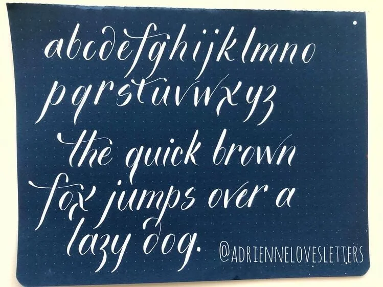
13. Stylized Copperplate
Written with the Blue Pumpkin pointed pen nib, Adrienne’s style has roots in Copperplate calligraphy but is actually a very modern style. In addition to her alphabet exemplar, this calligraphy artist took time to write a few words in this alphabet style.
We can see their carefully chosen stylistic elements in letters b, d, f, t, w and x. If you're interested in creating your own scripts and styles, you can learn this process step by step in our Style Study Bootcamp.
Adrienne is one of those calligraphers who can quickly learn any new hand and incorporate her own unique style right away. It’s quite impressive!
Spencerian Script Calligraphy Alphabets
Moving on from the Copperplate calligraphy alphabets, here we have the Spencerian script.
Instead of being written at a 55-degree slant, you'll notice that Spencerian is more italic.
This style actually has 2 slants:
The primary slant is 52 degrees, plus
A secondary 30-degree slant connecting certain letters
14. Spencerian Lowercase Letters
You might also notice a lack of contrasting thick and thin lines. While Spencerian has thick downstrokes like Copperplate, there's a lot less pressure applied to the pen, and therefore less shade on each letter.

👉 Tutorial: Spencerian Script For Beginners
15. Spencerian Script Capitals
The elegance and weightlessness of the Spencerian script really come through when looking at the Spencerian capital letters.
The shade is easier to spot when compared to the lowercase letters, but there's still a weightless and romantic feel to the letter style.
If these letters remind you of cursive writing, you have a great eye for typography! Spencerian was actually a precursor to the modern cursive alphabet.

Written by Jordan Truster
Try Spencerian on your computer with the Compendium font by Sudtipos.
15. Spencerian Script Flourished
Even though it's a humble script, Spencerian can still flourish like the best of them. This alphabet by Rodylyn is a mix of Spencerian and Madarasz styles.
Flourishes might not have been a common Spencerian element when the script was first invented, but any modern calligrapher can add their own style by adding embellishments or more intense shade on letters.
It's the small stylistic choices like these that make these calligraphy alphabets so unique. We love the contrast that Rodylyn created between the thick and thin strokes.
If you want to get more contrast when writing, consider a more flexible nib. Learn more in our beginner's guide to nibs.
Digital Spencerian Alphabet
Just like with the Copperplate script, Spencerian has been translated from paper to the screen and modernized with digital tools.
The iPad is a great tool for learning Spencerian script. We've even created the first iPad Spencerian course, where we'll go back to the fundamental teachings of this script and show you how to master it using modern tools. See if it’s right for you: iPad Spencerian Script Course.
17. iPad Spencerian Capitals
Beautiful stylistic choices can be observed in this script by Jeanine: slightly more shade on letters, lovely t-crossbar and slightly more pronounced exit strokes. This calligrapher also chose a white brush color, creating a strong contrast against the colorful background.
At its core this is a Spencerian Script, but with a personalized twist.

Gothic Calligraphy Alphabets
Did you know that not all calligraphy pens come to a single point?? Let us introduce you to broad edge pen calligraphy.
Fun fact: The first calligraphy class we (Jillian and Jordan) took as kids was for broad nib.
The precise nib width of a broad edge pen varies, but all broad edge pens achieve the same end result: stark contrast between thin and thick strokes.
Look closely at the tail on the letter x, or the loop of the letter e in the alphabet below and you'll see how contrasting the strokes written with a broad edge pen can be.
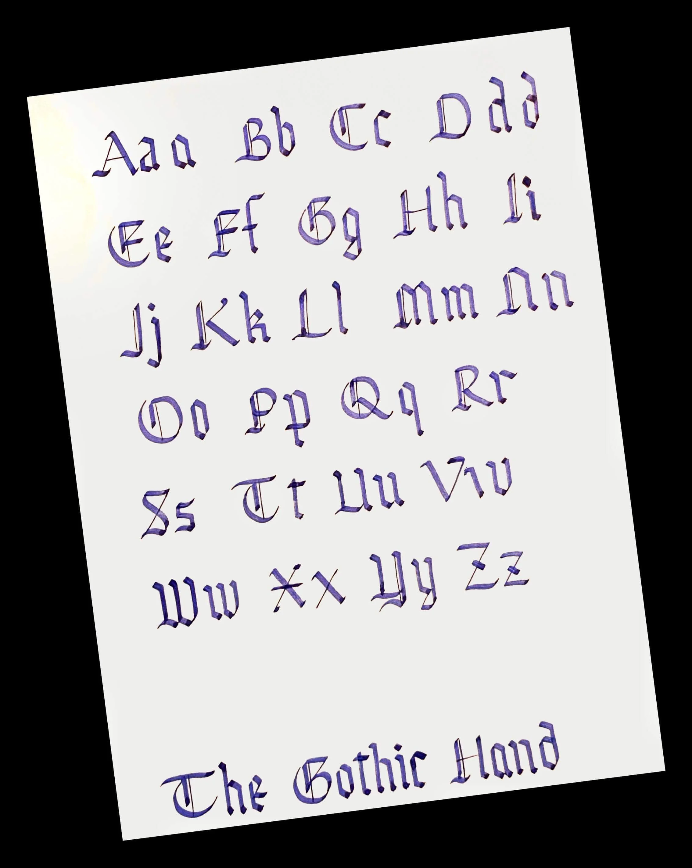
18. Gothic Textura Quadrata Alphabet
This alphabet style is referred to as gothic textura quadrata, gothic or Blackletter. The calligraphy alphabet example here, created by Talina, has a beautiful amount of detail on the capitals that brings an incredible level of elegance to an otherwise bold, striking script.
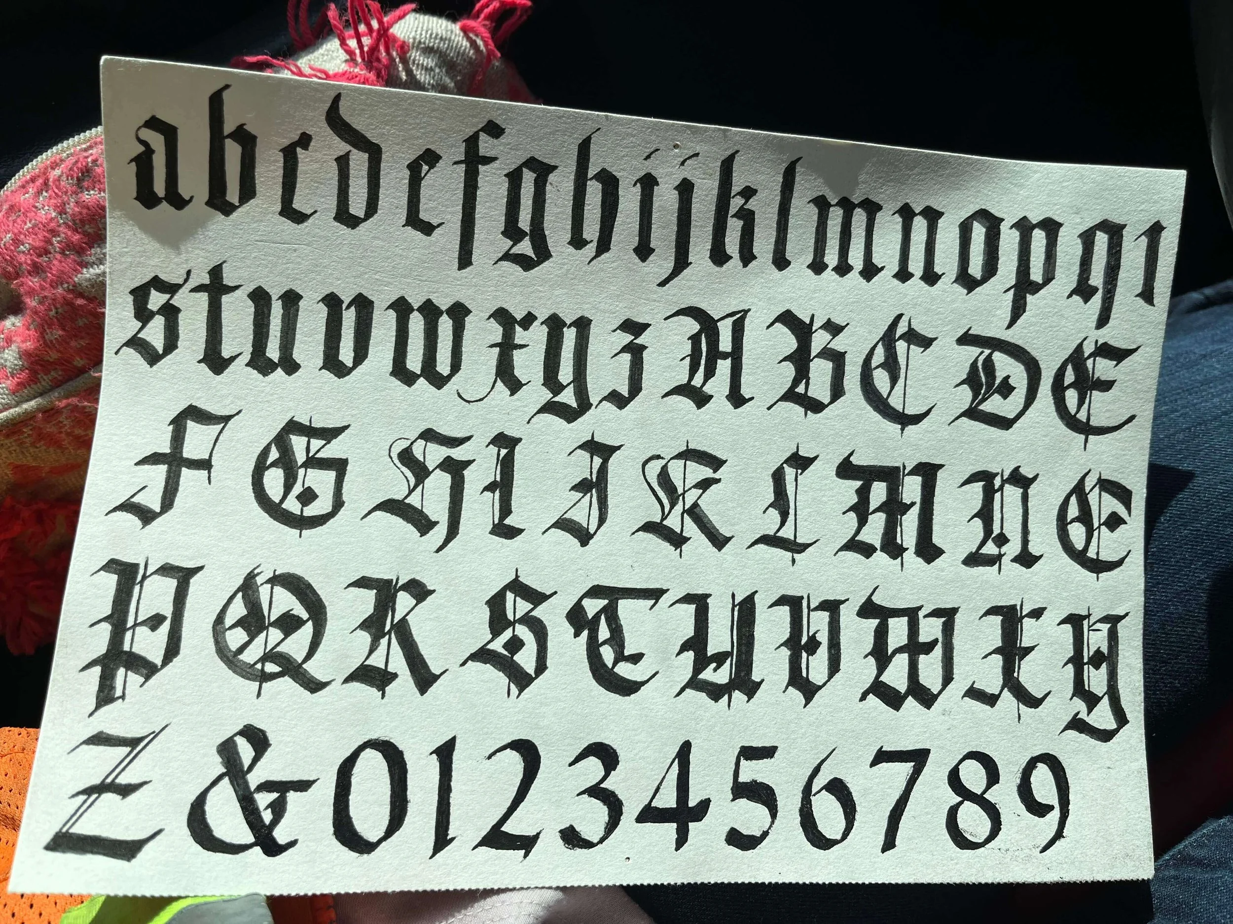
Submitted by Talina Hensley
You may also like: The 5 Different Calligraphy Pens
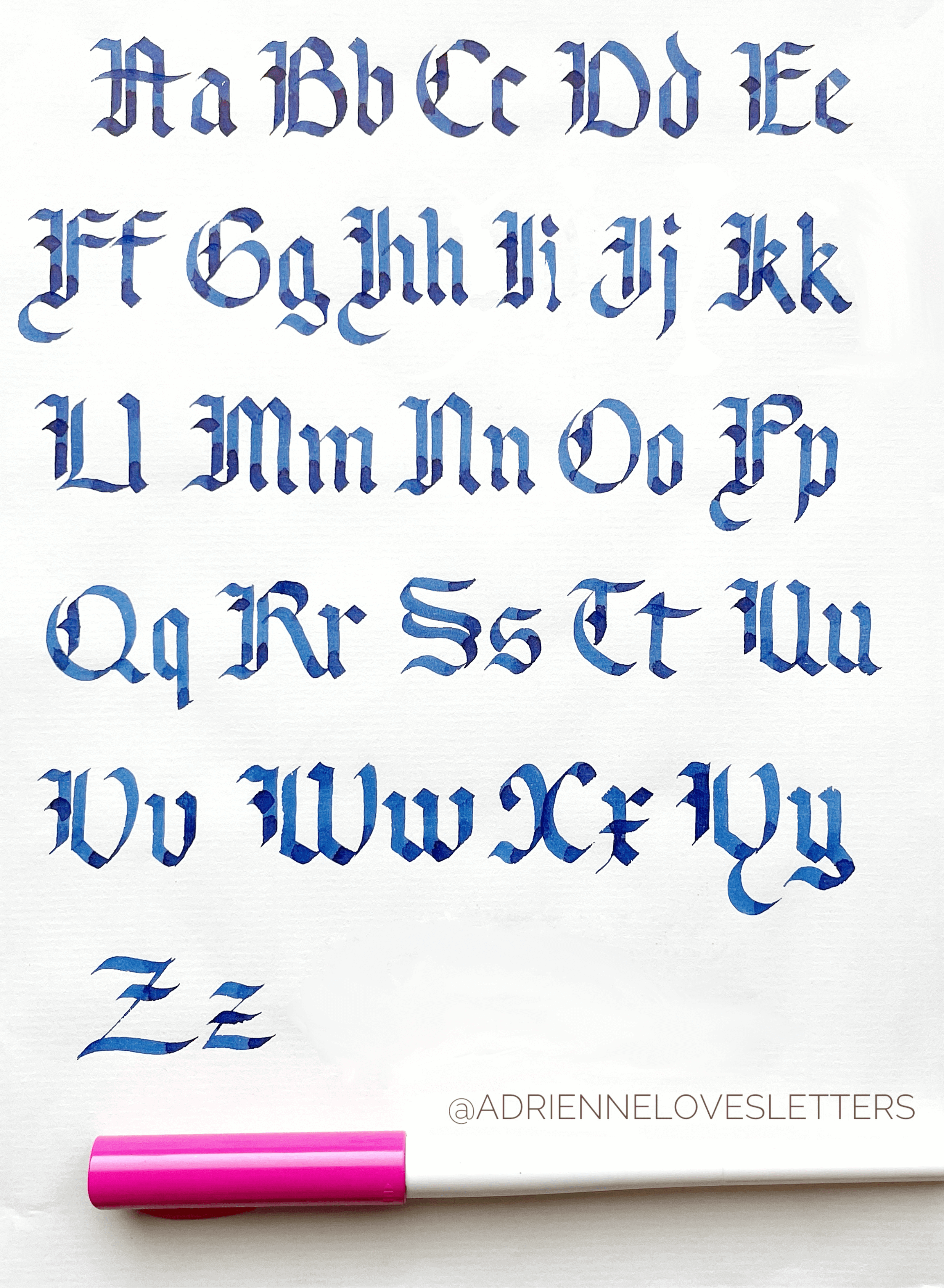
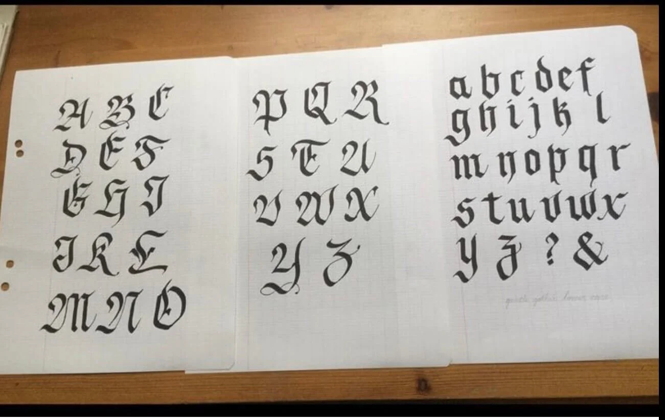
19. Simplified Textualis Quadrata Letters
Looking at a second Blackletter calligraphy alphabet example, we see another unique take on this style. This script is a simplified Textualis Quadrata style, which falls under the Gothic umbrella. This calligrapher, Adrienne, used a beautiful detached flourish style that's visible on the E, U and W.
Beyond the letterforms, you can zoom in on the hue and see depth and variation in the color blue. This is the result of using semi-transparent ink, and it's a creative way to lessen the contrast on such a bold lettering style. Written using a Pilot Parallel Pen 3mm.
Add a Blackletter font to your computer with the Blackletter font by Alit Design.
20. Ophelia Blackletter Style
A substyle of the Blackletter script, this is an example of Brenda’s Ophelia style. Here in this calligraphy alphabet, we see the use of squared dots, creating a unique embellishment. The detailing is both delicate, in the hairlines (the thin lines) and bold, in the dots. The overall letterforms are more curved than in previous examples, for example in the M and N.
This calligraphy alphabet was written on grid paper to help maintain consistent spacing, which is a practice that we highly recommend. We have more than 20 free calligraphy worksheets that we would love to share with you!

Submitted by Brenda Orr
21. Gothic Hand Alphabet
This calligrapher, the wonderful Carol, took a less contrasting approach with her letters, while still capturing the Gothic style beautifully.
A lovely detail is the use of semi-transparent ink, which creates depth and hue complexity within the letters themselves. Like most Gothic scripts, it's written using a broad nib and is a style that can be found in titles and on important documents. Carol is a multi-talented calligrapher and this style is of much sentimental value to her.
22. Gentle Gothic Style
Here we can see the variety within the Blackletter style with softer angles and more rounded letterforms, primarily noticeable in the capital letters. You can see great care in the hairlines of the exit stroke of the lowercase calligraphy letters.
This calligraphy alphabet sample was written by Jenny using a Pilot Parallel Pen.
23. Flourished Fraktur Capitals
We always remind our students that calligraphy isn't about writing quickly; it's about writing beautifully and taking your time. That patience comes to mind while looking at the level of intricacy and ornamentation in these letters!
This calligrapher, Colleen, took great care in her calligraphy alphabet to create style and embellishment that reflects the Blackletter style and essence. The intricacy is simply remarkable.
Submitted by Colleen Brant
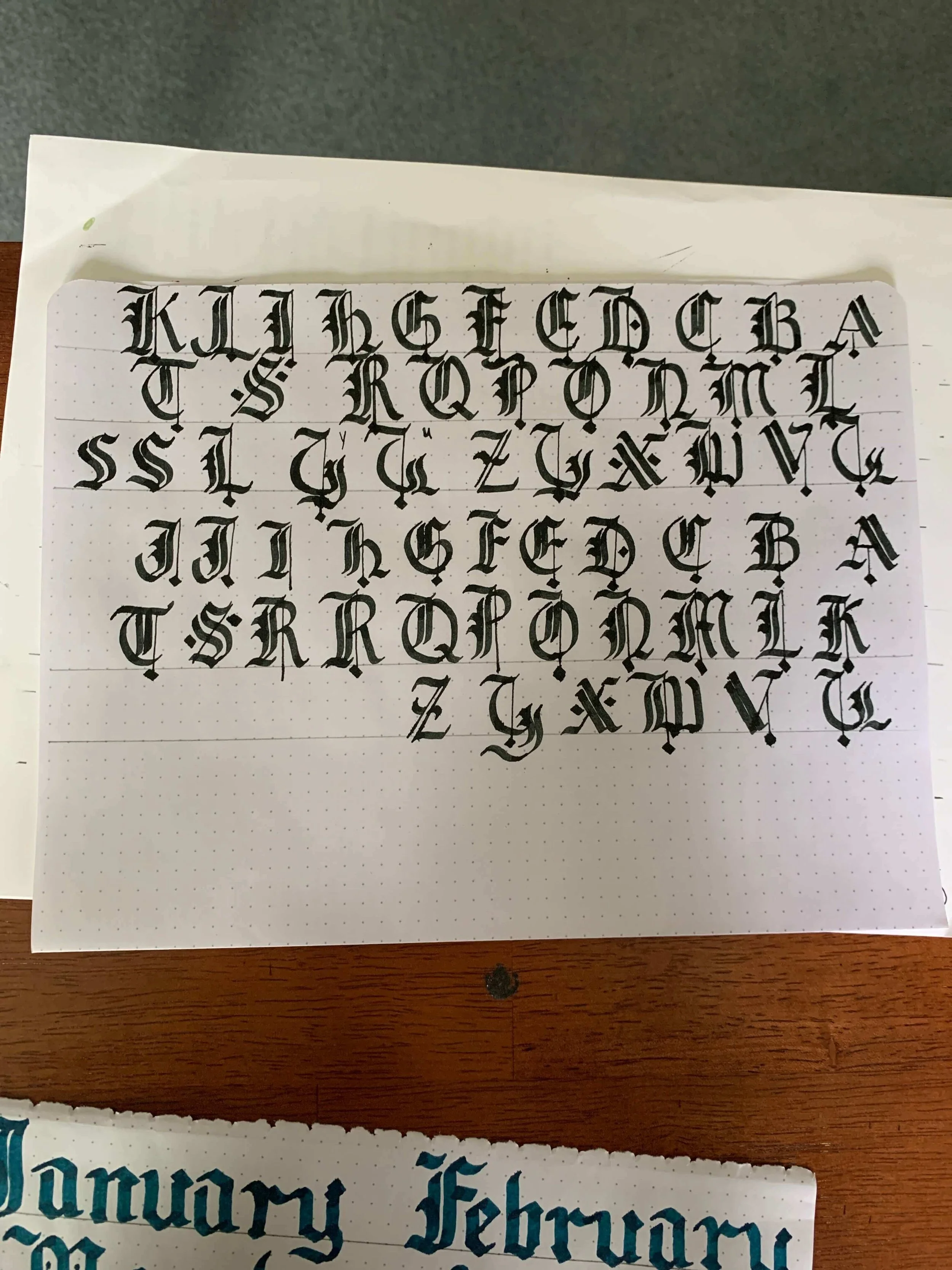
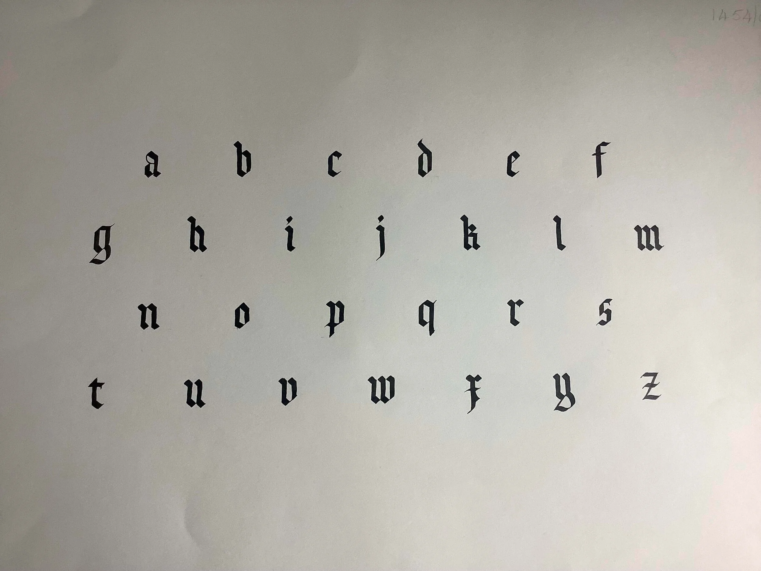
24. Gothic Lowercase Letters
After looking at the flourished Blackletter calligraphy alphabets, it's nice to bring this style exploration to a close with the precise lowercase letters created by Roland. The Blackletter script is a bold, angular calligraphy script that represents solidity and is still prevalent in modern society.
This script can be spotted in:
Newspapers
Tattoos
Ceremonial and religious documents
We appreciate the skill it takes to create this timeless style.
Submitted by Roland Brown
Other Traditional Alphabets
Now that we've covered the heavy hitters of the traditional calligraphy alphabet examples, let's look at some of the samples that fall outside of the big categories.
25. Foundational Script (Roundhand) Alphabet
At a glance, the foundational or roundhand calligraphy alphabet can look like Blackletter calligraphy. If you compare the styles closely, you'll notice that they both use a broad edge pen, but with key differences.
The foundational script:
Has rounder and gentler letters
Embodies a decisive change in aesthetic
Is more modern

Submitted by Roland Brown
Add a modern take on foundational script to your computer with this Foundation Display font by Letterhend.
26. Flourished Lowercase Letters
To round out the traditional calligraphy alphabets, we have an elegant flourished Copperplate calligraphy alphabet created by Jaclyn. The stylistic choices really come through this sample, from color to flourishes to overall composition shape.
This exemplar was created in the Procreate App using our free Procreate calligraphy brush and has beautiful subtle hue detailing. It's a fluid, intricate calligraphy alphabet that took great pressure control and consistency to create. Jaclyn has come so far in her calligraphy journey the last few years and has truly impressed with her dedication and style exploration.

Take our free Procreate calligraphy course to start learning digital lettering for yourself.
Brush Lettering Calligraphy Alphabets
Sometimes the fun in calligraphy is finding your own style by breaking the rules and traditions. Welcome to the world of modern calligraphy!
While traditional calligraphy relies on carefully learned structure, consistency and tradition, modern calligraphy likes to break the rules. The letters can bounce outside of the box, and calligraphers can use space, style and letter form in unexpected ways.
Let these creative modern calligraphy alphabet examples inspire you to brush the rules aside every once in a while.

Jillian writing with brush pens
27. Modern Calligraphy Brush Script
Like many of the upcoming modern calligraphy alphabets, this sample is in the brush lettering style. Brush lettering is created using a brush pen, which is essentially a calligraphy marker that has a flexible tip.
You can see natural variations between letters in this alphabet example, created by Therona, which is a natural part of lettering.
While the goal in calligraphy and hand lettering is consistency, it's natural to have slight variations between letters and that doesn't ruin the overall appearance of a composition.
In fact, handwriting fonts are so popular online because people enjoy the organic element!
Note: the alphabet below was actually drawn on an iPad, but it's a digital version of the brush lettering style.
If you want to add a similar modern calligraphy font to your computer, consider this Madelican script font by Subjectype.
28. Contrasting Modern Letters
Also a form of brush lettering, this calligraphy alphabet created by Stephanie is a higher-contrast sample with nice bold downstrokes. It feels fun and free.
Want to try higher-contrast writing?
On your iPad, you can achieve this look by pressing harder on the screen for downstrokes, or turning up the Apple Pencil size percentage in the brush settings.
On paper, choose a brush pen with a more flexible tip and press harder on downstrokes.
The tiny loops on some letters (b, d, h, p, v, and w) are lovely accents that make this calligraphy alphabet feel playful and alive.

Submitted by Stephanie Steck
👉 Tutorial: Brush Pen Lettering For Beginners
29. Colorful Modern Brush Letters
This alphabet is a great demonstration that simple doesn't mean boring. In fact, simplicity showcases great skill.
The impeccable form, use of color and crisp contact between thin and thick strokes make this a well-rounded exemplar, and a textbook sample of brush lettering. This calligraphy alphabet was written with a Stabilo Pen 68 by Seemaab.

Start practicing your brush lettering with our free brush pen worksheets.
30. Curvy Modern Lowercase Letters
Here's our first flourished modern calligraphy alphabet! The flourishes in this calligraphy alphabet sample by Claudia are creative and showcase the calligrapher's individual lettering style. These unique ways of writing each letter are called letter variations, it's a great exercise to start carrying your letters once you're confident with the base alphabet.
Notice the added dots around the calligraphy letters - it's little details like that which make an alphabet feel loved by its writer. Written with a Uni Pin Fineliner Drawing Pen.
You can explore letter variations with our free letter variations practice sheet:
31. Lowercase Brush Lettering Alphabet 1
This is the standard brush lettering script, known for its contrast, flow and playfulness. Follow along letter by letter to learn this modern calligraphy alphabet for yourself. This was one of our oldest YouTube tutorials from years ago but it’s still fun to watch :)
Written using our instant download Brush Lettering Workbook:
👉 Tutorial: How To Use Brush Pens
32. Brush Lettering Lowercase Letters 2
Written with Camlin brush pens, this is a great example of a thicker higher-contrast modern alphabet example. We love the color choices that the calligrapher, Zumra, used to bring this alphabet to life, and the bold exit stroke gives this a strong personal style! The thicker exit strokes really tie all the letters together.

33. Digital Brush Lettering with Shadows
If you compare this alphabet style to the others, you'll notice variations to the letters such as a stylized ‘s’ and curvy ‘t’ crossbar, which is exactly what modern calligraphy is about.
This calligrapher (our lovely friend) Amanda, took a modern alphabet and added shadows, color and texture to the background, really turning this exemplar into an entire calligraphy composition. Nicely done!

34. Brush Lettering Calligraphy Capitals
Here we examine the capital letters of the brush lettering alphabet in a simple modern style. These letters are very fluid and dynamic, perfect for adding letter variations and flourishes.
Also written using our Brush Lettering Workbook:
35. Flourished Brush Lettering Alphabet
A lot of stylistic choices are on display with this gorgeous calligraphy alphabet by Petronella. The angle of the letters is unique to this calligrapher's style, as are the flourish shapes.
Beyond the overall unique letter style, this calligrapher took the time to add connective elements between the capitals and the lowercase letters. Simply incredible.
36. Flourished Modern Letters On iPad
Bounce lettering meets whimsy with this digital calligraphy example. Click to watch the bounced alphabet be drawn in the Procreate App using our Loveleigh Brush.
👉 Tutorial: iPad Flourishing For Beginners
Bounce Lettering Calligraphy Alphabets
Bounce lettering is a calligraphy style that breaks the rules and leaves letters playfully reaching above and dipping below where they normally live.
While some of the alphabets above also utilized aspects of the bounce style, here are dedicated examples that showcase this popular technique well.
37. Bounce Lettering Lowercase Letters
Here is our first example of a bounced calligraphy alphabet, created by Emily. This alphabet, written with a water-based dual-tip brush pen, is displaying a unique style beloved by many calligraphers.
Bouncing is the act of extending certain letters beyond the normal x-height, creating an organic and whimsical feeling.
Look closely at the letter m and you'll see that the last stroke dips below the rest, creating a bounce. This dip can be found in other letters as well.
Submitted by Emily Zhao
👉 Tutorial: Bounce Lettering Guide
Want to add a bounce lettering font to your computer? The Floral Boutique Font by The Ink Affair is a bouncy modern calligraphy font that even incorporates flourishes!
38. Flourished Bounce Lettering Alphabet
This calligraphy alphabet is bounced, giving it a modern and fun feel. If you were to draw a straight baseline from the bottom of the lowercase a to the letter e, you’d see that the letters in between stray from that line and instead go up and down.
Zoom in on the bottom of the letter d, the top of the letter m and the variation of the underturns in u and you'll see the extensions and exaggerations that define this script.
The flourishes on this script on the ascenders d, h, and k as well as the descenders g, j, q, and y fill the negative space and give a lovely airy feel to this alphabet.
39. Bounced Minuscules On iPad 1
Bounce lettering can be done on paper or digitally on the iPad.
Watch this mesmerizing bounced calligraphy alphabet be written on the iPad using our Loveleigh Brush. These letters are drawn with our color-changing brush, which is an effect that offers a really artistic and dynamic touch to the humble alphabet.
40. Digital Bounce Lettering 2
Next we have a cheerful, fluid and vibrant calligraphy alphabet from Kristin. The subtle color changes within each row of letters add a lovely layer of sophistication and depth.
The varying angle and slant give this take on the alphabet a very lively and personalized aesthetic.
Submitted by Kristin Rose
41. Digital Bounced Letters 3
This modern calligraphy style from Rachel is picture-perfect!
The strokes are expressive, the bouncing makes it feel dynamic, and overall it's a very trendy and artistic take on the calligraphy alphabet. This was drawn using the Loveleigh Brush from the iPad Calligraphy Basics course. Rachel is a talented lettering artist who can create a wide range of impressive styles.
You may also like: 20 Online Calligraphy Courses
42. Brush Lettering Bounced Letters
"Learn the rules, then break them," is one of our philosophies that we share with our calligraphy students, and this sample displays that beautifully!
The creative rhythmic flow of this alphabet showcases this individual calligrapher's style effortlessly, and is a great example of how modern calligraphy breaks the rules to create fonts unique to each individual.
Drawn using a Dual Zebra Brush Pen, this modern calligraphy alphabet is bounced and has a distinct uniqueness to the letters.
43. Brush Pen Bounced Alphabet
Drawn with a Tombow Fudenosuke brush pen, this is a modern calligraphy alphabet in a lightly bouncy script style from Heidi.
It's an elegant, stylish and contemporary take on the brush lettering alphabet, with a lot of the calligrapher's personal style coming through. You can tell that Heidi has tons of practice and is a true artist based on this gorgeous exemplar.
44. Lowercase Blended Brush Pen
Proving just how energetic, lively and dynamic an alphabet can be, this blended alphabet leaps off the page. It was designed by longtime friend of Loveleigh Loops, Tom Bijnens.
The separated letters and partial flourishes result in a clean, crisp composition where the hues of the letter shapes shine. This calligraphy alphabet is lettered with two Pentel Brush Sign pens. (And can we all admire the eye-catching composition of the photo?)
👉 Tutorial: How To Blend Brush Pens
45. Capital Letters Comparison
Take a look at two of our own alphabets side by side in this comparison video. These different styles are both forms of modern calligraphy done with a brush pen.
Fun fact: this is our most-viewed video on our YouTube channel with over a million views! If you'd like to subscribe, we publish new videos weekly.
You can follow along with Jordan by downloading our free capitals practice sheet.
46. Crayola Calligraphy Alphabet
Most calligraphy markers are flexible thanks to having a brush-like tip. Crayola markers aren't quite as flexible, but you are able to press down and achieve a thick downstroke with added pressure.
In this video, notice how the letters of the alphabet have both thick and thin lines as pressure is lessened and applied.
Written by Jillian (Loveleigh Loops):
👉 Tutorial: How To Do Calligraphy With Kids
47. Modern Styled Letters
This modern calligraphy alphabet has a contemporary and elegant style with its sleek and angled letters. Characterized by a slant and flowing strokes, this script embodies traditional calligraphy and modern flair.
This composition looks like it's been written on paper, but it's actually written on the iPad by the very talented Mai. She sure knows how to create an eye-catching piece!
While nothing can compare to handmade, a similar calligraphy font to this alphabet example is the Water Brush font by Robert Leuschke.
Hand Lettering Alphabet
Hand lettering and calligraphy look very similar, but there's an important distinction: you write calligraphy letters, but hand lettering letters are drawn. For this reason, hand lettering can sometimes be referred to as faux or fake calligraphy. While written calligraphy always follows a specific style and convention, the styles and letters of hand lettering are truly endless.
Video: Hand lettering vs calligraphy
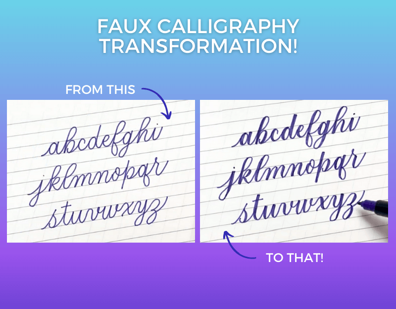
48. Faux Calligraphy Alphabet
See the hand lettering process below with this alphabet example. First, the alphabet is written in monoline. Then, parts of each letter are darkened with shade to create contrast between thin and thick lines.
Even though the word "faux" might sound negative, faux calligraphy is something that we do a lot of! We have an entire free faux calligraphy course that you can join now. Practice your faux calligraphy letters by downloading your free worksheets in the course and following along with the videos.
Written by Jillian (Loveleigh Loops)
👉 Tutorial: Faux Calligraphy Steps
49. Flourished Hand Lettering Minuscules
Here's an example of the hand lettering alphabet on the iPad from Cristin that combines a number of styles: bounce lettering, flourishing and faux calligraphy.
You can tell that this calligraphy alphabet is classified as hand lettering by looking at the black outline on the colored letters: normal calligraphy letters wouldn't have a black outline separating strokes. We love the melded styles, color distinction and the composition crispness of the flourishes in this calligraphy alphabet. Cristin is a true artist and one of the best humans!
50. Beveled Hand Lettering Majuscules
Another stunning piece, Cristin took time to add lovely coloring details, making these letters feel like they're carved from gemstones and popping off the page!
These beveled alphabet letters were drawn in the Procreate App. Because hand lettering requires each letter to be outlined and each stroke drawn individually, you can bet that this 3D alphabet took lots of time and patience to create.
51. Hand Lettering Sans Serif Capitals
In this simple but creative sans serif capital alphabet, letters are written boldly with simple letterforms. While a hand lettering alphabet like this looks simple, achieving equal space between letters and consistent letter height takes a lot of practice!
52. Sans Serif Block Letters
A close relative to the past hand lettered alphabet, here we have a color-coded version of the sans serif letters. Jillian's broken them down into their most basic components so that you can see how the individual strokes are drawn.
This hand lettering alphabet (as well as the next few examples) are from our free kids' calligraphy workshop.
53. Dotted Capital Alphabet (Free Printable)
The dotted sans serif calligraphy alphabet merges the simplicity of a sans serif typeface with dots within the letterforms.
With its slender letterforms and clean lines, this hand lettering style presents a sleek look.

Written by Jillian (Loveleigh Loops)
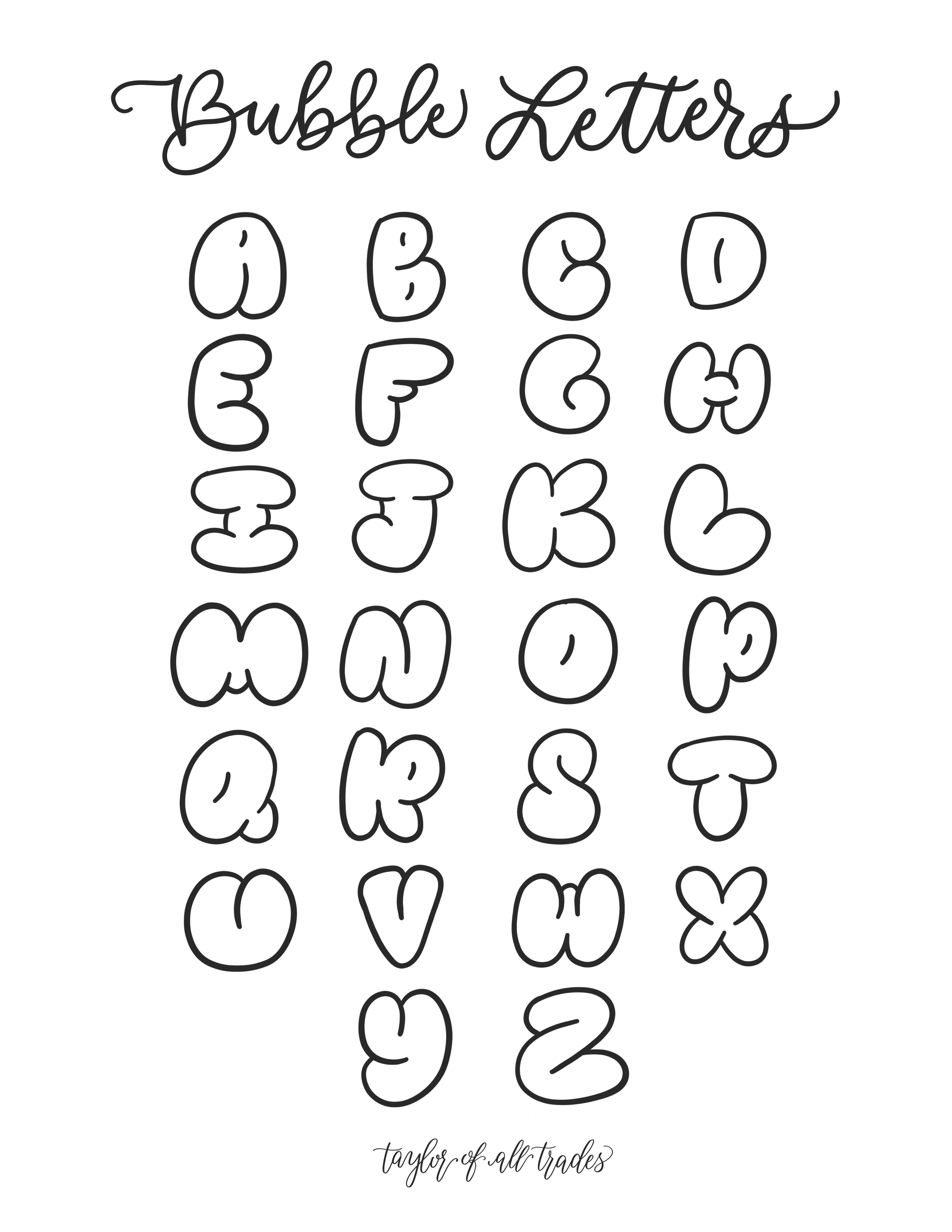
54. Capital Bubble Letters (Free Printable)
Here we have a bubble letter hand lettering alphabet that was created as part of a kids calligraphy worksheet. In bubble lettering, letters are characterized by puffy, rounded forms, offering a lighthearted and lively aesthetic and Sophie brought this one to life.
55. Monoline Calligraphy Alphabet
The word “monoline” means that the line has a single weight. Unlike calligraphy that has variation between thick and thin lines, monoline letters are created with a thin stroke all throughout. You can even use monoline letters as the base for faux calligraphy, or leave them as-is for a more airy look.
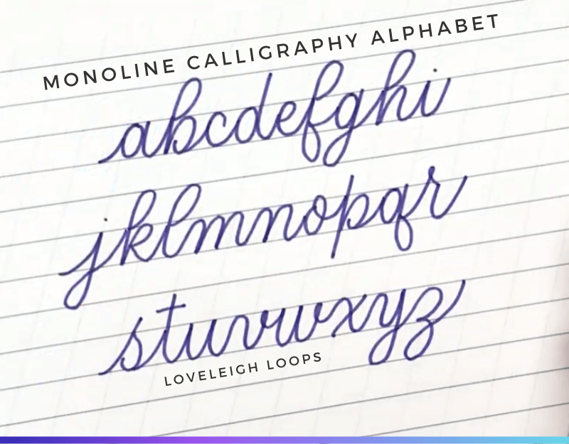
Written by Jillian (Loveleigh Loops)
56. Cursive Calligraphy Alphabet
Is there such a thing as the cursive calligraphy alphabet? Cursive writing isn't technically calligraphy: the letters are all the same width, so they lack the thick downstrokes that give calligraphy its characteristic flow.
Still, we wanted to highlight a simple form of the cursive alphabet alongside the other modern calligraphy alphabets here. These cursive alphabet letters were written with a monoline pen and are a great foundation for hand lettering and penmanship in general.

Try typing in cursive with this beautiful monoline cursive script font by Molly Suber Thorpe.
57. 3D Bounce Lettering Lowercase Letters
Drawn using Ohuhu brush pens, this happy, bouncing calligraphy alphabet was written by Hadassah using lovely connective elements and embellished with thoughtful design elements.
The flow of this script is playful and dynamic, and the additional design elements like the shadows and the pattern make this a really playful calligraphy alphabet. You may notice that the letters also have a bounce element to them, also classifying this as a bounce lettering alphabet!

Submitted by Hadassah
58. 3D iPad Lowercase Letters
These 3D alphabet letters are practically popping off the page! Drawn digitally with the Loveleigh Brush by the talented Melanie, this modern calligraphy alphabet was created in the Procreate App, this composition has so much detailing, like the:
White highlight on the right-hand side of the letters
Shadow below each letter
Texture within the shadow
This calligraphy alphabet feels playful, vibrant and trendy enough to hang on the wall as a piece of art.
Explore a similar modern calligraphy font on your computer with the Yellow Rabbit Font by Typhoon Type and Suthi Srisopha.
Watercolor Calligraphy Alphabets
We've entered the enchanting realm of watercolor alphabets! Let's quickly explore the unique qualities that set watercolor apart from traditional ink, brush pens or digital lettering.
Watercolor calligraphy creates a captivating, graceful blend of organic movement and hues. The vibrant pigments and delicate brushstrokes are enough to make you fall in love and want to try this style for yourself.
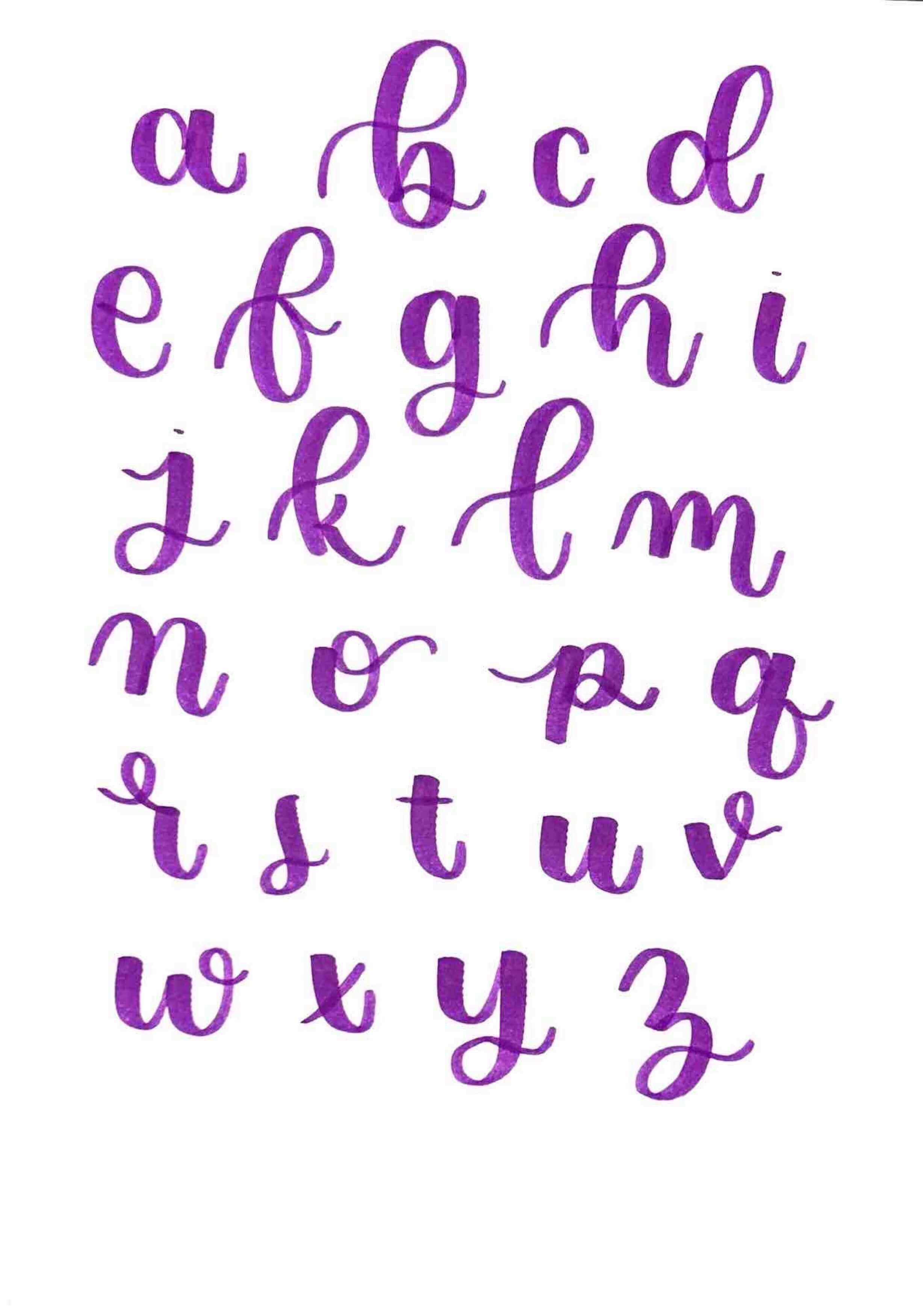
59. Watercolor Minuscule Letters (Paint Brush)
Our first watercolor alphabet! The watercolor medium brings depth to the coloring of the letters. The variation between vibrant pink and a whisper of color gives this alphabet style a lively aesthetic.
Letters are shown in a modern calligraphy style with bouncing. This calligraphy alphabet was create with a watercolor palette and paint brush on watercolor paper.
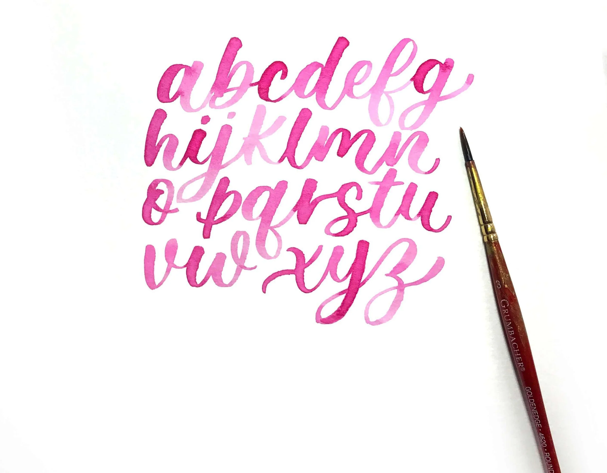
Written by Jillian (Loveleigh Loops)
You may also like: DIY Watercolor Lettering Backgrounds
60. Watercolor Letters (Water brush pen)
Drawn using a Pentel Aquash waterbrush, here's a different variation of the watercolor calligraphy alphabet.
Watch in real time as each letter is drawn, which takes Jillian more than 8 minutes! We practice what we preach here at Loveleigh Loops: take your time and enjoy the process.
Improve Your Calligraphy Skills
In order to improve your calligraphy skills, you'll need to practice and learn to self-critique your letters. Zoom in on these areas:
Letter consistency
Angles
Negative space
See here how we go through each letter in the alphabet one by one and critique it for consistency:
Next Steps
Did these calligraphy alphabet examples inspire you to get writing today?! We hope that you'll be excited to try writing the calligraphy alphabet for yourself, and you'll make yourself at home here at Loveleigh Loops.
While there were a lot of different tools on display here, including a lot of brush pens and calligraphy pens, beginners don't need special supplies to write calligraphy or do hand lettering. You do not need specific tools to start practicing the calligraphy alphabet. With a pencil and scrap paper, you can practice pencil calligraphy.
We have TONS of free resources that we want to share with you to help you on your calligraphy journey:
Watch hundreds of tutorials on our YouTube channel
Learn about the different calligraphy tools and what style they produce in our Calligraphy Tools And Styles Guide
Explore how to even start your own calligraphy business in our calligraphy business guide
Join our Facebook Group and come meet your new lettering friends
We hope that you'll stick around so that we can be a part of your calligraphy journey.