Copperplate Uppercase Alphabet Beginner's Guide
There’s a lot of beauty, drama and elegance in the entire Copperplate alphabet, but it’s especially true with the Copperplate capital letters.
From the basic strokes all the way to elaborate flourishes, the Copperplate majuscules are an impressive part of the Copperplate script that we’re thrilled to teach you today.
Pause now to save for later! ↓
These letters go by a few different names:
Copperplate capital letters
Copperplate uppercase alphabet
Copperplate majuscules
These terms can all refer interchangeably to the same capitalized version of the Copperplate letters.
In this Copperplate uppercase alphabet guide, you’ll learn:
The basics of the Copperplate uppercase alphabet
How to have a better practice experience
Plus, we’ll share free traceable practice sheets for you to download!
Table of Contents

The Copperplate capital letters from A to Z
Copperplate Calligraphy Basics
While brush lettering and digital calligraphy are fun modern iterations of calligraphy, there’s something special about traditional Copperplate calligraphy.
It’s still beloved around here at Loveleigh Loops, and we really believe that anyone can learn the Copperplate capital letters, whether you’ve been practicing calligraphy for years or are still a beginner!
We fell in love with the intricate twists and turns of this script at a young age and have been exploring it ever since.

We’ve even developed a unique framework for learning and practicing the Copperplate capital letters, but we’ll get to that in a minute.
Before we get started with the tips and tricks, it’s important to make sure you’re set up for success with the right tools to start writing.
Copperplate calligraphy requires a few special tools, none of which are particularly expensive or hard to find.
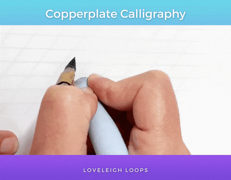
Here you can see the main star of Copperplate calligraphy, the pointed pen:
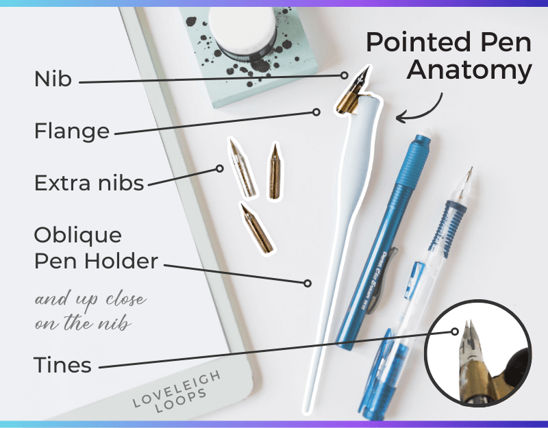
A pointed pen may be intimidating at first, but it’ll feel like an old friend before long.
There are 4 main tools needed to do Copperplate calligraphy:
Pointed pen holder: This is the name for the special utensil that you use to write Copperplate. We recommend the Moblique penholder for beginners.
Nib: This refers to the pointed end of the pointed pen holder. We recommend the Nikko G Nib for absolute beginners, but if you have more experience with pointed pen, you can read our more expansive recommendations in our nib guide.
Ink: A household pen comes with ink inside of the pen body, but a pointed pen gets dipped into a reservoir of ink. We recommend Sumi ink. For help with ink, reference our ink troubleshooting guide.
Calligraphy paper: Pointed pen calligraphy requires thicker paper with a smooth surface to avoid damage and bleeding. We recommend HP Premium 32lb Paper.
Don’t have any tools yet? You can actually start practicing the style of the Copperplate alphabet using a pencil and can switch over to a pointed pen later!
The oblique pen holder is probably the most alien-looking tool on this list and requires some getting used to, but all of these tools will become familiar very quickly.
Learn how to put together a pointed pen with our beginner’s guide.
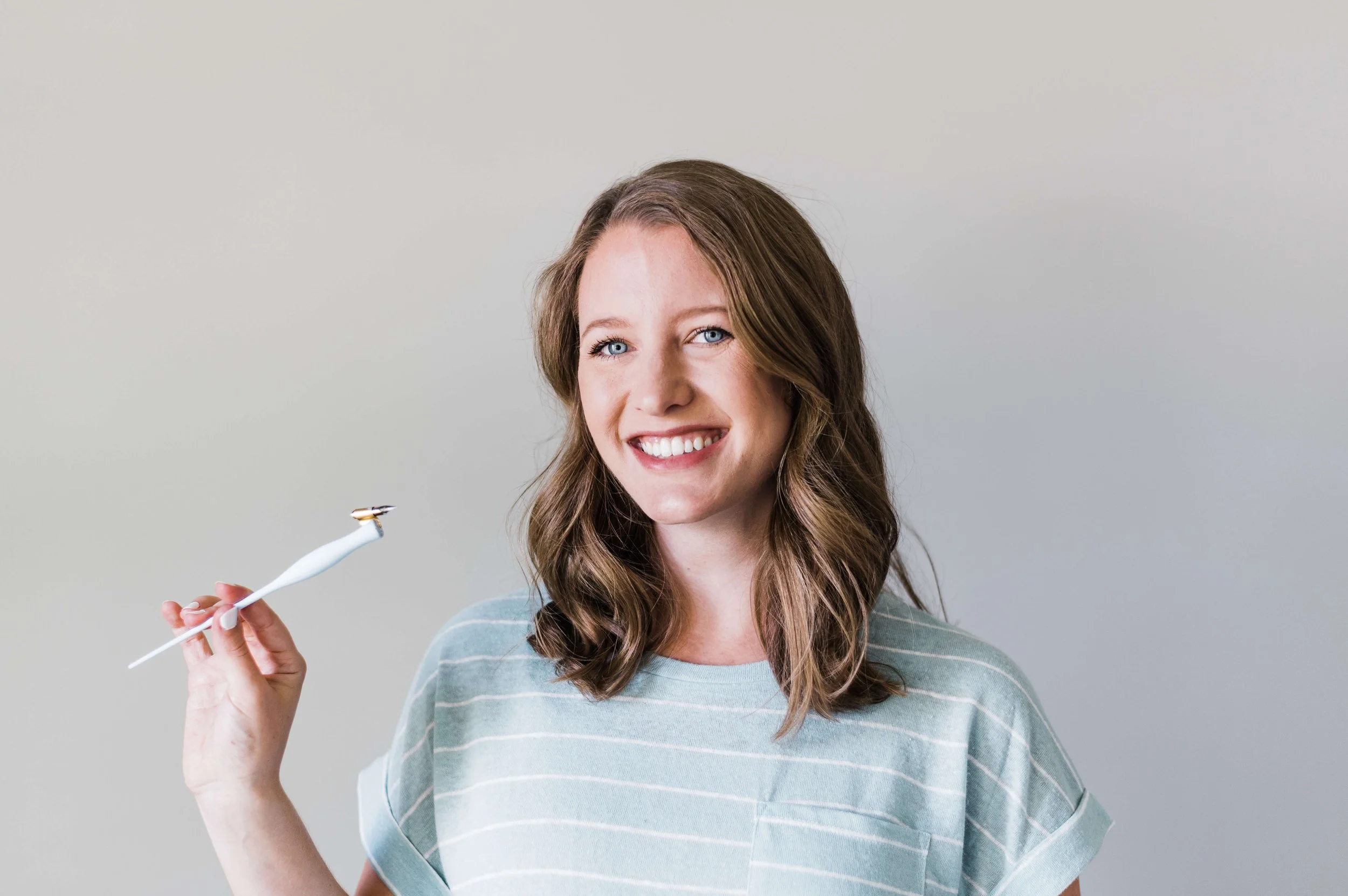
We all remember what it was like to put our nibs in for the first time. You’ll learn so quickly!
Rest assured that we’ve all gone through the same learning curve. Repetition is going to build muscle memory and you’ll start to see yourself progress with every practice session.
If you don’t know where to start with these (or any other!) calligraphy supplies, we’ve got you covered with our free supply guide to help you put together your personal calligraphy starter kit:
Click to explore the popular different styles of calligraphy and the tools that create them.
The Copperplate Script
When calligraphers talk about Copperplate calligraphy, they refer to a script that was popular around the 18th and 19th centuries.
Traditionally, publishers printed books using sheets of metal. A writer would engrave or etch their work on a copper sheet and hand it over to be used in a printing press. Eventually, this process gave its name to the script we now call Copperplate.
Here’s an example of Copperplate written in real-time:
The capital letters that you see here are highly decorative: that’s an effect called flourishing.
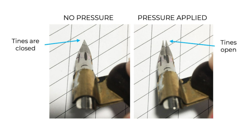
Look closely and you’ll notice that one of the main characteristics of Copperplate is the contrast between thick and thin lines.
Through the application of pressure, the writer is able to add shading to their letters which gives the script a very elegant look.
The change in thickness is achieved through different pressure levels on the tip of the pointed pen (the tines):
It’s precisely this aspect of Copperplate calligraphy that makes practice and muscle memory so important.
You may also like: All About The Spencerian Script
Copperplate Uppercase Alphabet Practice
Learning to write the Copperplate capital letters means learning and embracing some of the customs and traditions that come with it.
We’ve already gone over the traditional tools of the trade, and there’s another element of Copperplate practice that’s important to embrace: the basic strokes.
Traditionally, Copperplate calligraphy is written by breaking every letter down into smaller sections, called the basic strokes.

These are the basic strokes that make up the lowercase alphabet. Click to read our full letter-by-letter lowercase guide.
Writing each letter piece by piece may sound tedious, but given that the goal of calligraphy is to write as beautifully as you can (not as quickly), there’s no pressure to rush through your letters!
You can think of learning calligraphy like learning a piece of music: instead of practicing the entire piece again and again, it’s best to isolate the difficult passages and master them one at a time.
Using a slanted worksheet is essential to getting the most out of your practice sessions:

Click to download our free Copperplate capital letters practice sheet!
This free practice sheet teaches the capital stem stroke (which we’ll show you in a minute) and has blank guides that are slanted at a 55-degree angle.
Without the guidelines and slanted lines, it would be near impossible to get letters that are even in size, angle and spacing.
Before looking at the letters themselves, let’s take a closer look at the basic strokes and their importance in the Copperplate capital letters.
Reminder: print your practice sheets on HP Premium 32lb Paper to avoid shreds of paper getting caught in your nib:

Paper shreds in your nib will surely lead to frustration and messy letters.
The Capital Letter Basic Strokes
You may be familiar with the 8 basic strokes of the lowercase alphabet, and the uppercase alphabet uses a different set of strokes altogether.
For the uppercase alphabet, we focus on practicing 7 fundamental strokes: 4 capital stems and 3 entry elements.
You can see the strokes in action here, building the letters A through E:
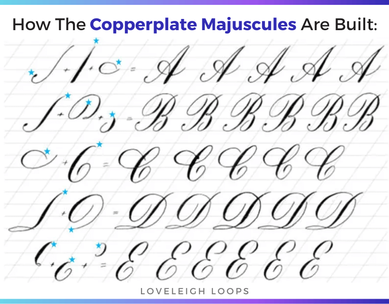
This example is from our Copperplate workbook on Etsy
Important note: other calligraphers might name a different number of fundamental strokes for the uppercase letters.
Some calligraphers might even classify up to 20 different letter elements!
But after years of studying and teaching the Copperplate majuscules, we’ve developed our own system of 7 strokes:
Universal line of beauty
Hairline universal line of beauty
C-curve
Vertical curve
Reverse oval
Extended compound curve
Horizontal oval
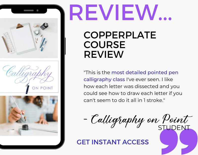
We go much deeper into this inside our Copperplate course, Copperplate on Point:
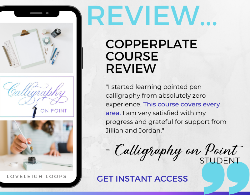
Get instant access to our complete Copperplate curriculum
We’re confident that our method is a very simplified and effective approach, which is what makes it so beginner-friendly (even if you’ve never held a pointed pen before, like our Calligraphy on Point student quoted above).
Ready to dive in and examine the alphabet?! Let’s look at the basic strokes piece by piece and see how they make up the uppercase alphabet.
You may also like: Recommended Traditional Calligraphy Supplies
Copperplate Capital Letters
It’s time to examine the Copperplate capital letters more closely, and there’s good news… they aren’t nearly as hard as they look!
Looking at the Copperplate uppercase alphabet A to Z, can you now see different strokes that have been used to build each letter?
Capital letters are only complicated if you practice them the wrong way. We’ve broken them up into different letter families to make learning and practicing much more straightforward.
You may also like: How To Find Your Calligraphy Style
First up…
The Capital Stems
The capital stems are the primary elements that make up each letter. You can think of them as the backbones of your alphabet. We’ve identified 4 different capital stems that ground all of the majuscules.
Learn even more in our tutorial:
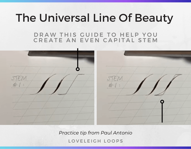
1. Universal Line Of Beauty
This roughly S-shaped curve is also known to some as the capital stem. It starts with a hairline and is shaded once it approaches the slanted line on your worksheet.
When writing, pay special attention to the shaded part: the goal is to have it follow the slanted line without deviating from it. Avoid making it look like an actual S.
Besides giving this stem its proper name of the Universal Line Of Beauty, famous calligrapher Paul Antonio provides a few handy tips on practicing this stem that we have used in our own practice.
We go over this stem in even more detail in our video tutorial.
He recommends drawing a straight line on the 2nd ascender, then continuing down the slant line before ending with another straight line on the baseline.
When you do this, creating the Universal Line Of Beauty becomes simply a matter of connecting the dots.

Can you spot the Universal Line Of Beauty in any of these letters?
You may also like: Top Calligraphy Books
2. Hairline Universal Line Of Beauty
The 2nd stem looks identical to the Universal Line Of Beauty EXCEPT for the shading, and the direction of movement.
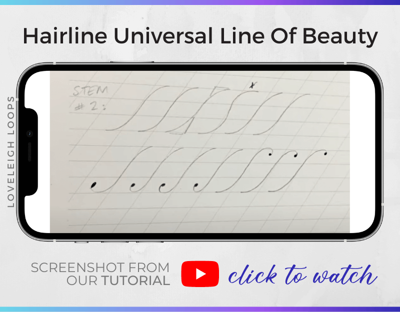
With this stem, we start at the baseline and move the nib in an upwards direction.
Psst. Having trouble remembering the names of the guide sheet lines? Here’s a cheat sheet:
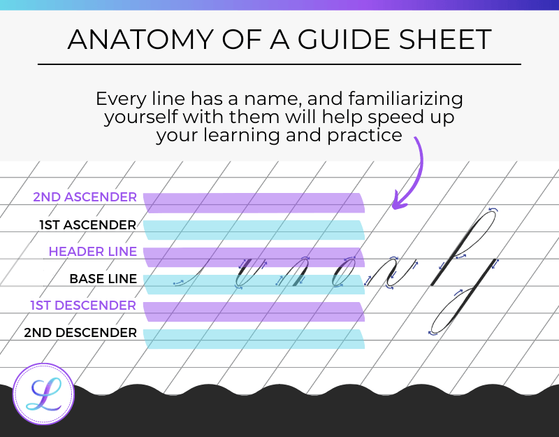
Learning these names will help your practice immensely!
Keep in mind that in Copperplate, upstrokes are always thin.
Once again, avoid the actual S-shape and make sure to follow the slanted line. Once you hit the line, you stay on the line until you come off it at the top.
You may also like: The Different Types Of Calligraphy
3. C-curve
The third stem looks like a giant C-curve and is a little tricky at first.
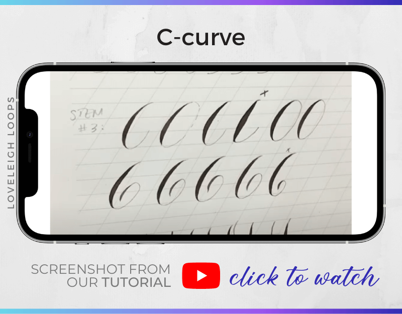
We start off at the top and go all the way down to our baseline, adding shade as we go.
Keep in mind that the C-shape doesn't have a straight line in it. Instead, we want the entire path to be curved.
The best way to practice this stem is to create several large oval shapes. You’ll see that after making a few of them, the movement feels more natural.
You may also like: Pointed Pen For Beginners
4. Vertical Curve
The last stem stroke is almost vertical, and it’s not hard to see where the name “vertical curve” comes from!
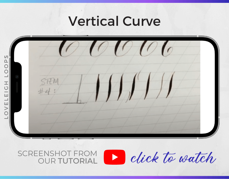
For this last stem stroke, we abandon the slanted line to create a stroke that is perpendicular to the baseline and has a little bit of a curve to it.
Unfortunately, this is also what makes this line harder than it appears. Creating a line that is at a 90-degree angle requires some practice. Avoid having your stroke lean back too far.
You may also like: The History of Calligraphy
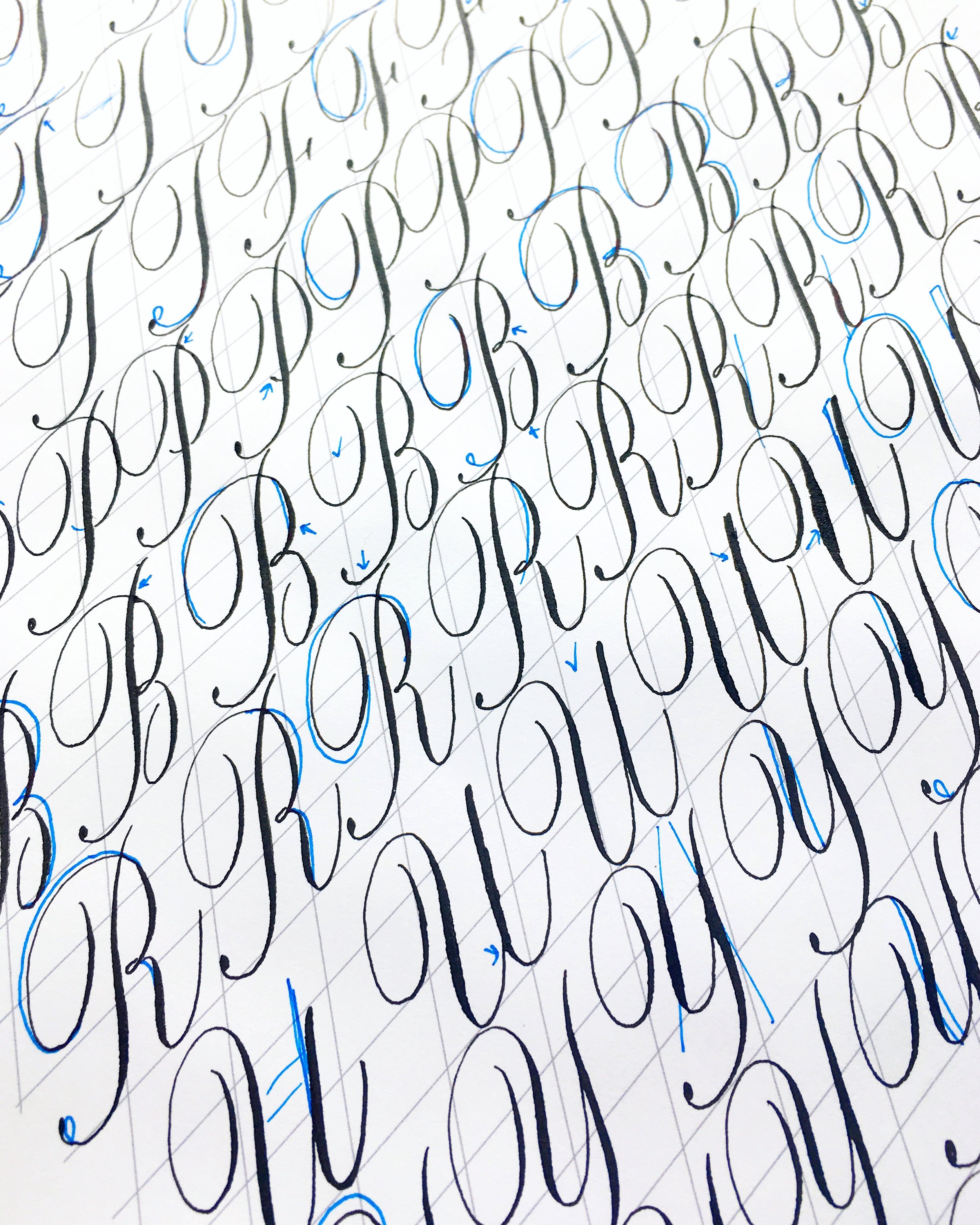
Practicing Copperplate majuscules with self-critiques. What you’re learning now is only the beginning!
Entry Elements
Entry elements are lines that lead into the capital stems. Capital stems are the backbones of your letters and entry elements are the secondary elements that are less pronounced.
While capital stems take up a lot of space, entry elements are smaller. Instead of going from the baseline up to the second ascender, entry elements tend to start at the header line.
Likewise, the shaded parts of entry elements don’t have the same thickness as those in capital stems. A slightly thinner shade is called a secondary shade.
You’ll see that making your entry elements less pronounced results in balanced capital letters.
See it in real-time in our tutorial:
You may also like: Monoline Faux Calligraphy Tutorial
5. Reverse Oval
If you’ve been practicing your lowercase basic strokes, you’re probably familiar with the oval shape.
The reverse oval goes clockwise rather than counterclockwise. The result is an oval with shading on the right side instead of the left.

When you want to make this stroke for your capital letters, start just below the 2nd ascender line to give yourself a little extra space to end your stroke in different ways.
Rather than closing the oval, you can:
End the oval with a horizontal, slightly curved line.
Add another curve after the oval shape.
Keep the curves going even more by adding a compound curve.
By changing the way you end your oval shape, you can create many variations that are all based on this entry element.
Here’s a glimpse down the road at ovals and flourishing!
Practice them and don’t hesitate to come up with your own twists as you get comfortable and build confidence!
You may also like: Calligraphy Project Prompts
6. Extended Compound Curve
Does the compound curve stroke ring a bell?
The second entry element is basically a compound curve with an extended entry and exit stroke.
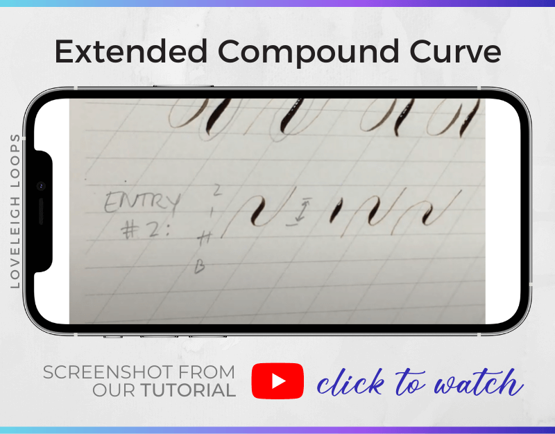
Start at the header line, go up and start your curve when you reach the halfway point between the first and second ascender.
Finally, extend the exit stroke all the way up to the second ascender.
Make sure your curve is still only one x-height and don’t forget to add shade to your downstroke!
You may also like: Calligraphy Alphabet With A Brush Pen
7. Horizontal Oval
After an oval and a counterclockwise oval, we now have a horizontal oval. Normally, an oval is upright, but this time it’s wider than it is tall.
For this stroke, the movement is still counterclockwise, resulting in the shading being on the left side of our oval.

Once again, the entry element forms the base of several variations. Which variation to choose depends on which letter or capital stem you’re going into.
The horizontal oval starts between the first and second ascender and goes down until it almost touches the header line.
You may also like: Calligraphy Pens Guide
Copperplate Capital Letter Examples
Now that we’ve covered the fundamental strokes of the uppercase alphabet, it’s time to put it all together. Let’s look at a few examples of how you can use the capital stems and entry elements to create capital letters!
For our examples, we’ll look at two letters that each start with a reverse oval as the base but ends the oval in a different way.
Capital Letter T
The capital letter T is one of the easier capital letters to learn. To create it we need only two things:
Capital Stem: The Universal Line Of Beauty
Entry Element: A reverse oval that ends with a horizontal curved line
You can see it in action here:
Putting the two elements together results in a beautiful capital T.
Although you can add shading to your entry element, keep in mind that the entry element is of secondary importance. Make sure your shading is less wide than the shaded part in the capital stem to retain a sense of balance.
You may also like: Calligraphy Flourishes For Beginners
Capital Letter P
Similarly, you also need just two elements to create the capital letter P. In fact, we can make this letter by using the same strokes we used in our previous letter:
Capital Stem: The Universal Line Of Beauty
Entry Element: A reverse oval that ends with another curve
When you combine these two elements, you can create the capital letter P.
You can watch this in real-time in our tutorial:
You can give your letter a nice touch by extending the final curve in your entry element after you’ve combined them. Details like this give your calligraphy a more stylized look.
You may also like: Cursive vs Calligraphy
Exemplar Copperplate Majuscule Models
As we learned and developed our system for teaching the Copperplate majuscules, we learned so much from a few exemplar calligraphers over the years that we’d like to credit them for their influence:
Nina Tran, who can be found on Instagram @anintran
David Grimes, who can be found on https://masgrimes.com/
Younghae Chung, who can be found on Instagram @logos_calligraphy
Next Steps
You can create endless exciting variations and flourishes within the capital letters, and we hope that this Copperplate majuscules guide gives you the information that you need to jump right in!
There’s a lot to explore with the uppercase alphabet, and this is just the beginning of your journey.
We’d love to be your calligraphy teachers! We have a resource that can fit every budget:
Our Calligraphy on Point course
Click to read more about our popular Copperplate course
Our Copperplate Calligraphy Workbook on Etsy
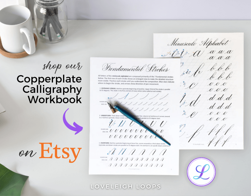
Get instant access to our Copperplate workbook, which has 300 5-star reviews
For anyone who’s not in a place to make a financial investment, we teach SO much in our Copperplate YouTube tutorial
Plus, browse other free and paid calligraphy classes
Wherever you’re at with your progress, we’re here to support you! We know that learning Copperplate takes time and support, which is why we feel so lucky that you’ve chosen to learn with us on your journey.