The Secrets To Calligraphy Composition & Layout
Have you ever struggled with arriving at a perfect final piece with your calligraphy or lettering? Where you find yourself staring at your calligraphy compositions and layout with feelings of frustration or a lack of direction?
That feeling that you KNOW something's off, but it's hard to tell exactly what.
Calligraphy is supposed to be a form of art! How come your calligraphy composition doesn't feel like it?
Pause now to pin this post for later! ↓
Bookmark this page or save it on Pinterest so you know where to find it
Working on your compositions can feel challenging, especially when you don’t have any idea where to start or how to improve.
We know—because we’ve been there. But we’ve broken it down and are sharing what we now know.
This article is all about answering this single question: how do you practice and eventually get better at creating beautiful calligraphy compositions?

The evolution of Jillian’s design. Keep reading to see the final composition!
Together today, we're going to fix the biggest challenges that calligraphers and letterers face with their layouts and compositions:
Knowing how to arrange words in a pleasing way
Coming up with new ideas (making it less “boring”)
Understanding exactly how to improve
There’s so much beneath the surface of a good composition
In this post, we'll share specific tactics and ideas to achieve balance and harmony across your page so you can walk away with a box full of tools to evaluate and improve your own calligraphy designs.
Whether you're doing your calligraphy with a pointed pen, brush pens, or in Procreate, these elements of good calligraphy layout and composition will move mountains for you.
But before diving into the details, let's first touch on the basics.
Once you pull back the curtain on calligraphy composition and layout, you’ll be free from those frustrations
Table of Contents
What Is Calligraphy Layout And Composition?
When we talk about calligraphy layout, we mean the process of turning your calligraphy practice into a "finished" piece of art.
No matter how effortless they may look, good designs (usually) don't just happen. A skilled designer is able to create a beautifully finished composition through a series of intentional choices.
This is true for a lettering composition, a painting, a song, a photo - these fundamentals of design apply to all works of art!
But what are these "intentional choices?"

The elements of design are the invisible forces behind great layout and composition
The Elements Of Design
In design theory, these intentional choices are called the elements of design.
Try thinking of your layout as a recipe and of the elements of design as the individual ingredients. When faced with a dish that seems bland, a chef will decide to adjust the ingredients until the dish tastes right.
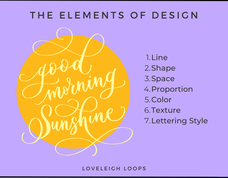
The elements of design that apply to calligraphy and lettering
Mindset: Working on your calligraphy layout and composition doesn't require flashy new skills. It requires an increased awareness of your options (and practice!).
To get an idea of how each of the elements impacts your design, let's pick the 6 that are most relevant to calligraphy and lettering and examine examples of each of them in action.
Prefer to watch instead? This information was originally shared on our YouTube channel via a live Composition Confidence workshop:
1. Line
Line is one of the most straightforward elements to experiment with in your layout.
The idea is very simple: A drawn line connects two arbitrary points in your design. Invisible lines within your writing also dictate how many breaks there are in the sentence:
This has one line.
This
has
four
lines.
It's a simple concept, but that doesn't mean it's limited. In fact, there's a lot you can do with this humble element in your calligraphy layout.

See the different lines at work in this composition? This comes from a Lettering Layouts online course by Teela of Every Tuesday.
Calligraphers have 3 fundamental choices:
Line Breaks: Do you write all the words on one line, or break them up?
Direction: Horizontal, vertical or diagonal?
Curvature: Straight, curved or patterned line?
Each of these has a huge effect on your lettering layout. Let's look at what playing around can do for your composition.

The designs we’ll look at today were submitted by our talented calligraphy students
By experimenting with your approach to lines, you can give a different feel and shape to your pieces.
You may also like: The Different Types of Calligraphy
2. Shape
If you were to draw a line around your design, what form would it be?
With this element you have 2 things to consider: will you imply the overall shape of your letters or composition, or make it explicit by drawing a decorative outline around your piece, like a wreath or border?
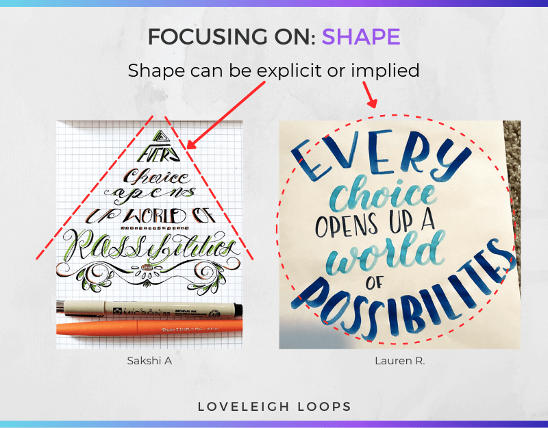
Look at the composition you’re working on now. Can you see a dominant shape coming into focus?
A few basic options are:
A square or rectangular boxes
A circle or oval
A triangle
You can also test out centering versus asymmetrical designs. Remember that centering goes both ways - horizontal and vertical. An inverted triangle composition is a great way to experiment with vertical asymmetry.
You may also like: Types of Calligraphy Pens Compared
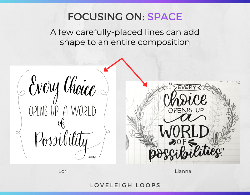
3. Space
After you've written your quote, what will you do with the rest of the space on the page? These empty parts are called negative space, and there are many different ways to handle it on your page.
Exactly how much space do you leave empty and how much space do you fill with decorative elements such as flourishes or embellishments?
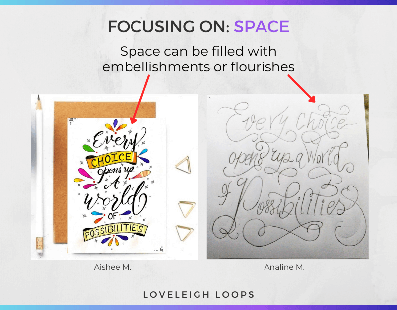
Space can also be left blank as “negative space”
Space within your composition can be easy to manipulate.
The works of art below show that even adding just a few well-chosen lines (or branches, in the second example) creates an entirely unique shape by filling in the otherwise empty space:
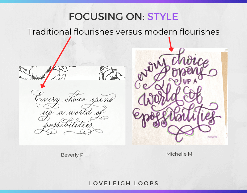
Reminder: Different scripts handle embellishments differently. For instance, a layout for a quote written in Copperplate calligraphy might require less embellishment than something written in the modern calligraphy style.
Copperplate calligraphy can rely on flourishing, while modern lettering will lean on drawn embellishments more to fill negative space.
You may also like: Traditional vs. Modern Calligraphy
4. Color
The default paper color (and therefore the default color of your background) is typically white, and the default ink color is generally black. However, you can easily play around with color by varying both the paper and ink.
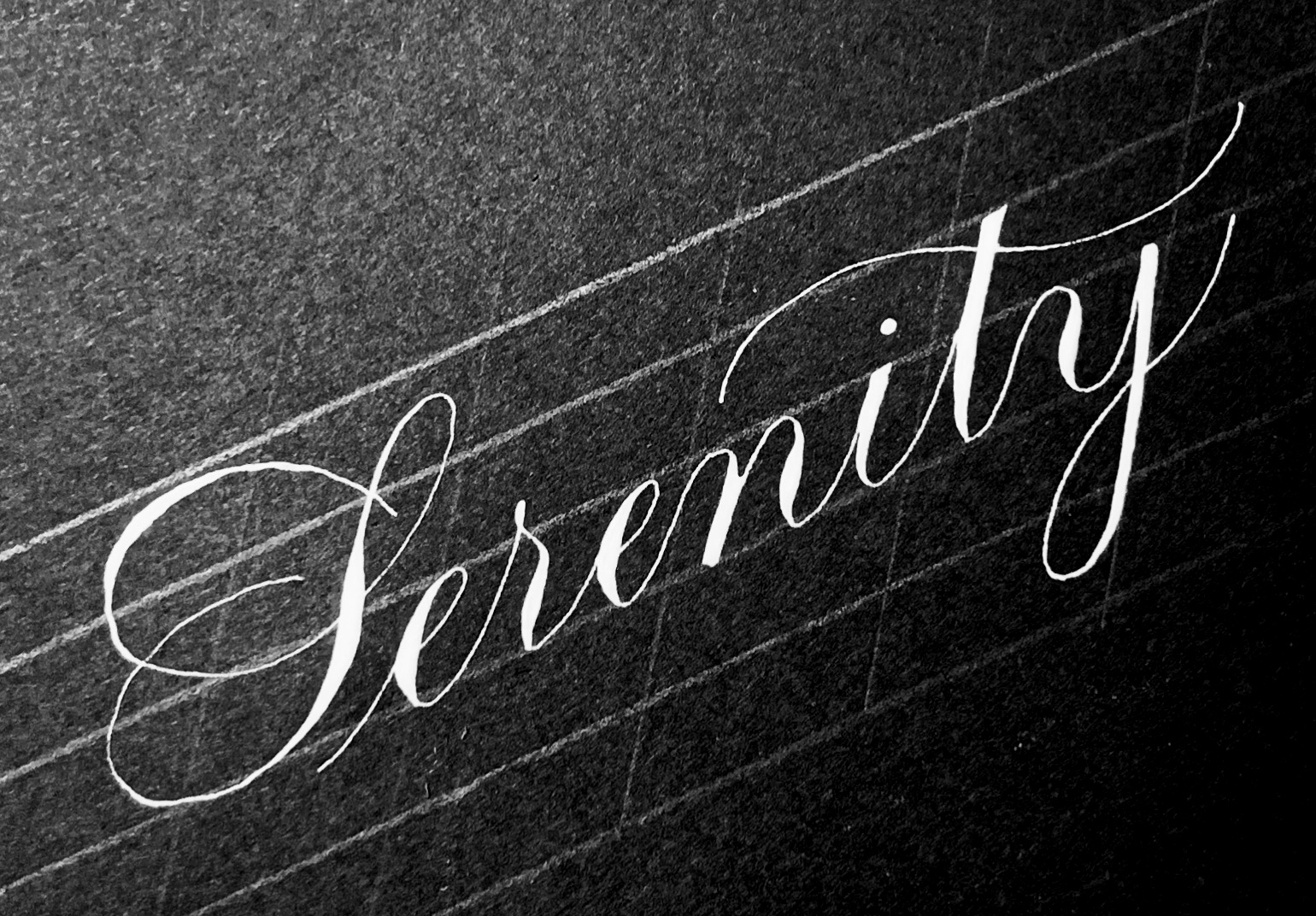
Black paper with white ink creates a radically different aesthetic
You may also like: Calligraphy Paper Guide
Deviating from this standard black and white can really make your piece come alive, adding emphasis and contrast.
When it comes to color choice, ask yourself 2 questions: what color will I use and where will I put it?
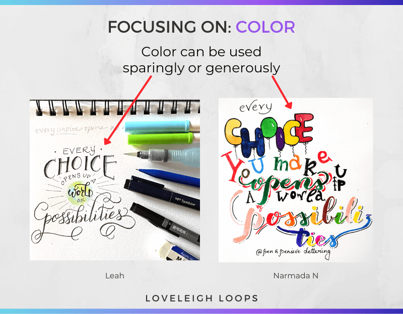
Use as much or as little color as you’d like - there are no rules, just different outcomes
There are many ways to add color to your design. You can decide to:
Color every letter of a given phrase
Add colored shading to a black letter
Use color to highlight the meaning of certain words
Change the default white background to something more adventurous
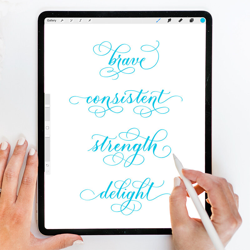
For truly unlimited color options, try your hand at digital calligraphy.
Digital calligraphy unlocks EVERY creative possibility. Learn more in our beginner’s guide
You can also go for the full wow factor by using different techniques such as the embossing technique to create truly stunning pieces of art.
Exercise: Post your next calligraphy or lettering composition on Instagram. Tag us in the post at @LoveleighLoops and use the #LoveleighLetters hashtag so we can see and celebrate your progress with you. We LOVE seeing your progress.
5. Lettering Style
To us, using different calligraphy styles and scripts is the most enjoyable part of calligraphy. We love how you can make a quote look completely different by switching styles.
You can learn even more about the different calligraphy styles and tools in our guide:
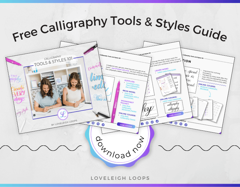
One of our most popular resources! Click to download
Using different lettering styles, you can create endless variations. So, what calls to you most?
Will you go for a modern calligraphy style such as bounce lettering, or something more traditional like the Spencerian script?
A single script or a combination of styles to emphasize certain words?
Which tools will you use? Pointed pen, brush pen or maybe pencil?
Even something that may seem standard, such as flourishing, can have radically different styles and executions
You may also like: How To Find Your Calligraphy Style
Speaking of tools, keep in mind that calligraphy pens and calligraphy styles often go hand in hand.
There are no rules chiseled in stone, but certain pens shine in specific types of hand lettering.
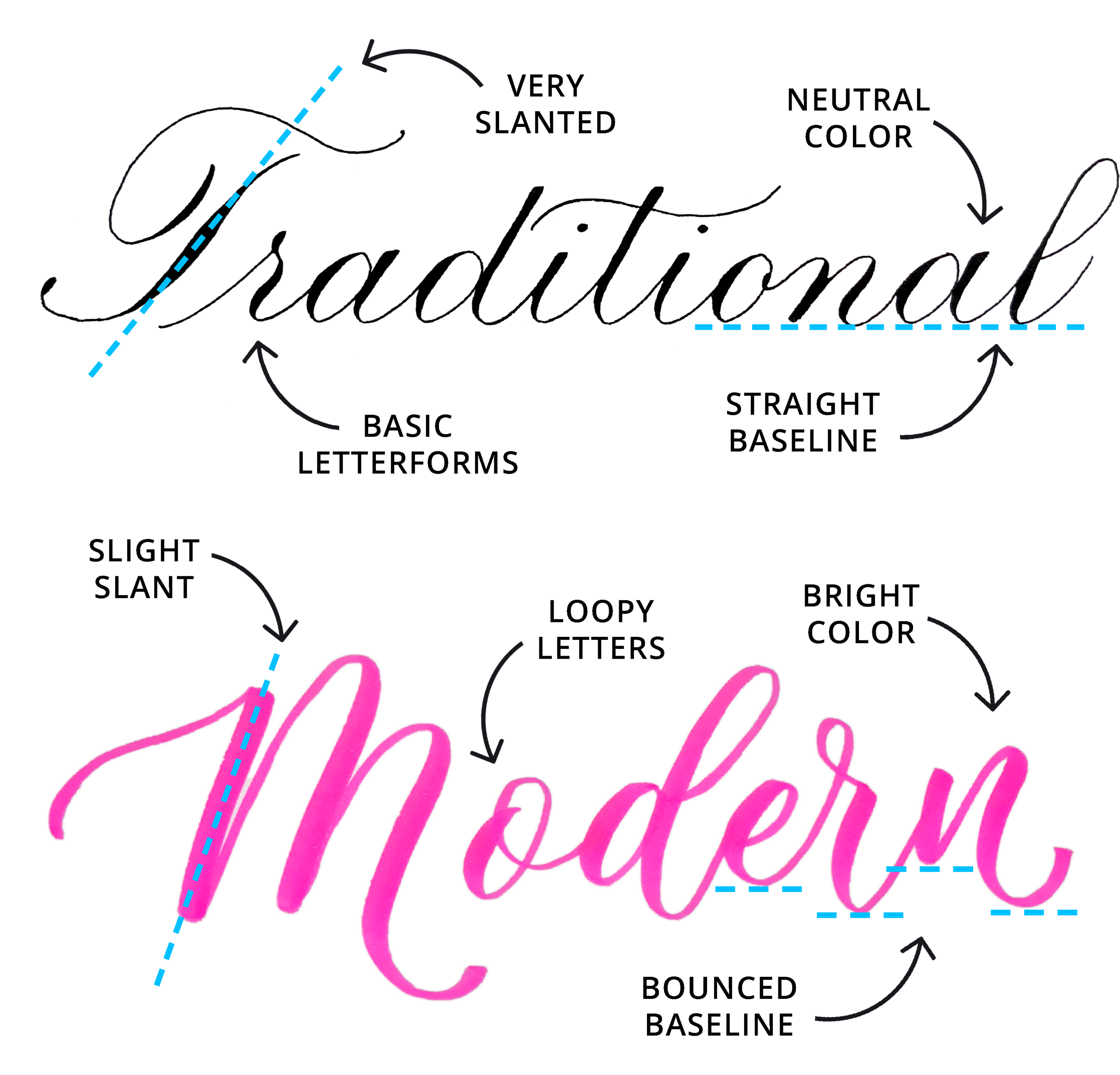
Traditional calligraphy typically uses a pointed pen and modern calligraphy often uses a brush pen
Although you might have a default style that you're most comfortable with, don't be afraid to step out of the box and try something new. The results may surprise you, and experimenting is what improving your calligraphy designs relies on!
6. Proportion
Proportion is a fancy way of describing relative size (A being bigger than B). It can also be referred to as “scale.”

Proportion is a great way to emphasize the most important word(s) in your design
Playing with proportion adds emphasis to important words and minimizes unimportant words.
Now that we've covered the elements of design, it's time to move on to the reasons why some designs work and some don't.
You may also like: How To Use A Calligraphy Pen
The Principles Of Design
When you want to sit down to lay out a composition for a piece of calligraphy or hand lettering, you'll find that being aware of the principles of design makes your process MUCH easier.
By understanding these principles, you'll be able to identify what's missing from your page and how you can use the elements we saw earlier to fix it!

The 6 principles of design
A skilled designer can write with various colors to add emphasis, combine different lettering styles to provide contrast, strive for symmetry to create balance, and so on to make a composition that's pleasing to the eye and that people enjoy reading.
Let's look at some examples of the most important principles at work.
You may also like: How To Improve Your Craft
1. Balance
Weight is more than just a physical calculation. When you craft your layout, be aware that all the words carry a certain visual heaviness to them. In order to even out your design, you need to carefully consider the placement of each of them.
Easy tip: Try drawing lines (mentally or in pencil) to see if each half of your layout is balanced. Using a horizontal and vertical symmetry axis for your layout saves you a lot of time. By looking at the horizontal and vertical symmetry, you quickly sense where things are off-center.
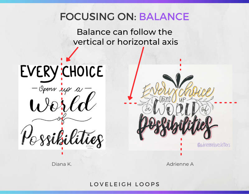
Drawing lines on your page can help immensely with balance
There are many ways to tweak the balance of a composition. When you find your layout is off, try restoring it by:
Using color to increase the weight of certain words or letters
Filling up space by using techniques like flourishing
Writing words in a different, contrasting lettering style to make them "heavier"
You may also like: The 8 Basic Calligraphy Strokes

The embellishments here are equally distributed, leaving this feeling even and balanced. This is from our brush pen comparison guide
2. Emphasis And Contrast
In any given sentence, some words are more important than others. When you're designing your layouts, always keep an eye out for words that carry the main focus of the quote.
You can highlight certain words by:
Writing them in a bigger font
Using opposite colors to add contrast
Experimenting with different lettering styles
Adding shapes to highlight the meaning
In the image below, you can see two effective ways of creating emphasis: using bigger letters and visualizing the meaning of the word, the calligrapher drew our eyes to the word "world."
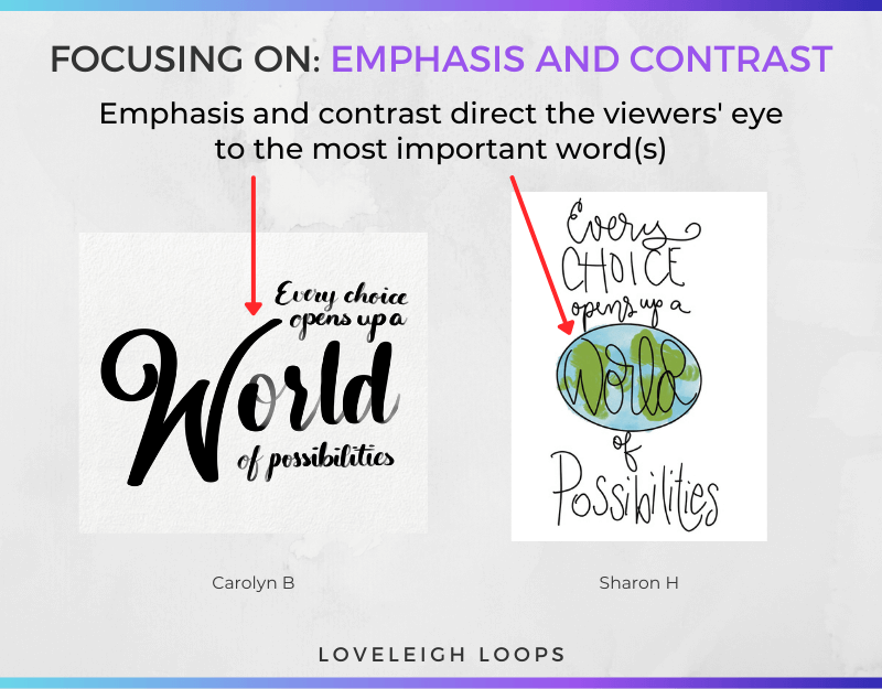
This is something that should only be applied to one or a few words, or else you risk losing the effect
Easy tip: A little goes a long way with emphasis and contrast. Rather than highlighting all the words of a given sentence, try to make your emphasis as pointed as possible. Start light and add more when necessary.
You may also like: Top Calligraphy Book Recommendations
3. Movement
We can take the idea of drawing the eye to certain words one step further by adding movement to your lettering.
Here we have several ideas that contain ways to guide our eyes. In these pieces of art, the artists chose to use decorative flourishes, line breaks, and curves to point your eyes in a specific direction.

Feel your eye move through the elements on the page
Exercise: Next time you're browsing on our website or on Instagram or Pinterest, look for the focal point of each composition. What's guiding your eyes there? Try to pull back the curtain on other projects that you see!
You may also like: Different Types of Calligraphy Compared
4. Repetition And Unity
One ink splatter is a mistake, but if you make five, it becomes a pattern. (That sounds like it should be an old saying!)
Let's go back to one of the designs we looked at earlier:
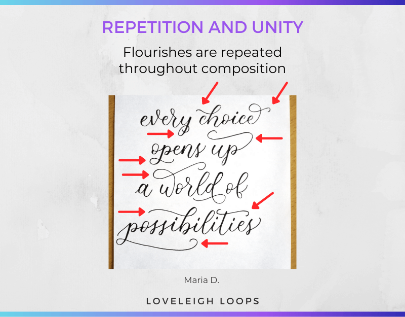
In this particular layout above, the recurring flourishes on certain letters add a sense of style and unity to the entire quote.
It would look very different if ONLY the first letter e was flourished! In that case, the e would be emphasized. But instead, the flourishes unify the entire composition.
Want to learn flourishing? You can get instant access to our course: Flourishing Fundamentals.

We promise we can make even the most technical aspects of learning flourishing easy to follow
Exercise: Try adding recurring decorative elements or design choices to your lettering. This helps to create a piece that feels more "finished" and unified. What reoccurring elements can you add to your composition? How does it change the look if you add it in 3 spots? 5? 20?
You may also like: How To Do Easy Faux Calligraphy
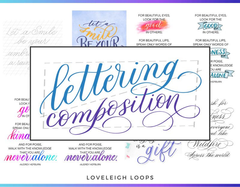
Putting It All Together
Now that we've gone over both the elements and principles of design, let's go a little more in-depth with a tutorial on how you can put it all together.
You have 2 options for working on your layouts: make it up as you go or lay out a plan.
1. Just Go For It!
If organic designing feels most natural for you, then have fun with it! There's nothing wrong with improvising your layouts, though be aware that it may require rewriting or starting from scratch.
For example, it can be difficult to make sure your quote appears at the center of the page without any measuring. You're also more likely to run into problems with the spacing of individual letters as ascenders and descenders are just hard to plan.
How the bounce lettering effect is achieved. This effect requires extra space
You also risk running out of space on the page after writing a few bigger letters leaving you with a tiny amount of room for the rest of the quote.
Easy tip: Try creating a rough draft, even if you only spend 5 minutes. Get a piece of paper and draw a quick outline. You can also even use a digital program like a Word Doc or Procreate if you prefer. You can make the rough draft smaller than the size of the final piece to get an idea of how it will look.
You may also like: How To Properly Hold A Brush Pen
2. Plan It Out First
After many failed attempts at eyeballing our designs, we've learned to take our time. In fact, most of our best work that you see on our website has been created after putting in serious thought and planning.
We find that things like accurate letter spacing and a clear center are just too much of a gamble when left to chance. While it may seem like a homework assignment to sketch things out first, we find that it's really a gift to the final piece and helps ensure that you check all of the necessary boxes. (And for us, makes the process less frustrating and more enjoyable.)
Jillian here!
To round off this composition tutorial, Jillian is going to put everything we've covered into practice.
Just like any work of art, it all starts with a simple sketch of the design.
There's no need to use tracing paper in this stage since it's about breaking up the quote.
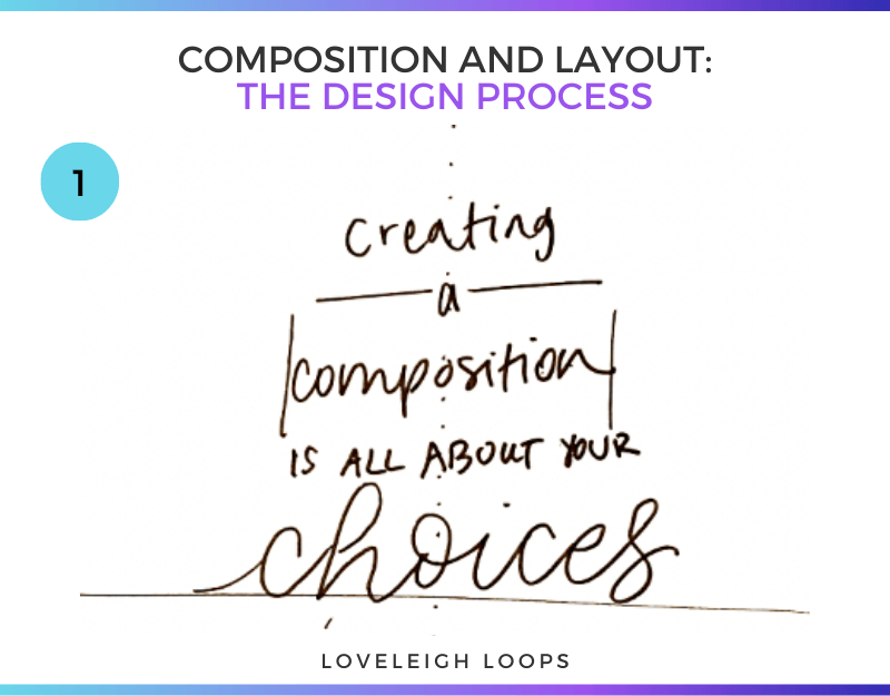
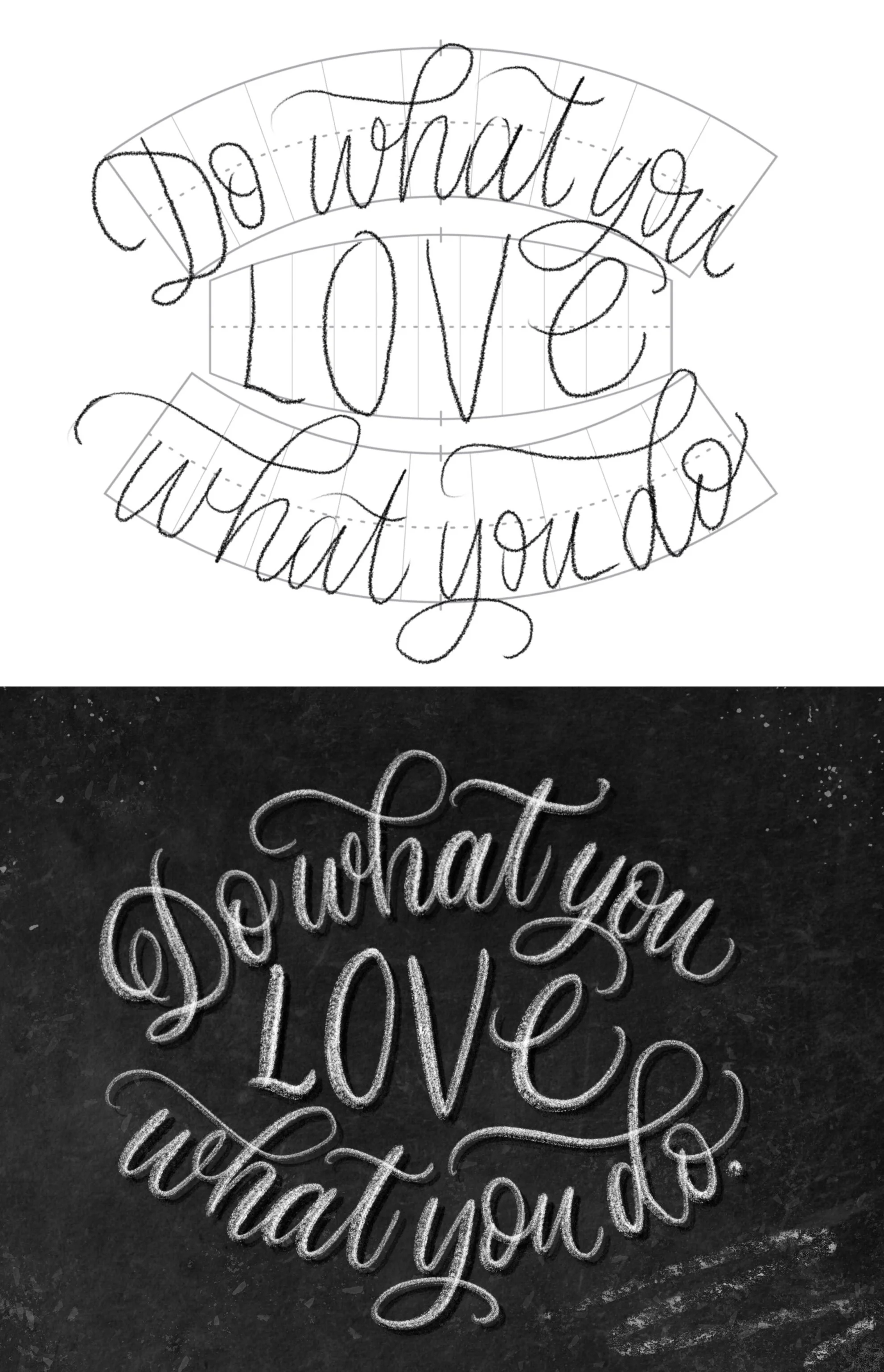
It starts with a basic sketch
The dotted line is there to help center and balance the piece.
After you decide where to put each word of the quote, it's time to move on to coming up with the first version of the final layout.
Jillian’s focus on...
Emphasis
Lettering style
Where to draw the eye and
How you'll use the spacing between the letters on the page
...are all decided at this stage.
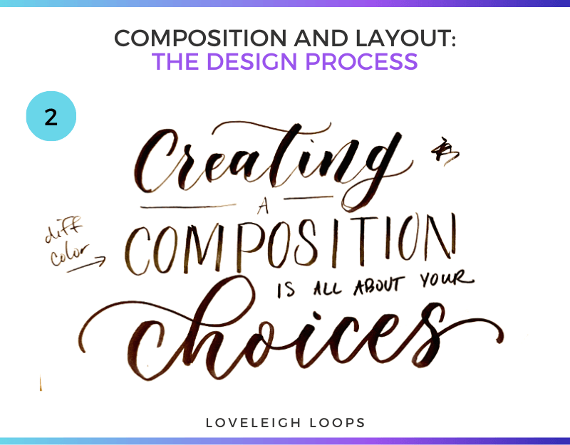
Start layering the elements of design and making notes
As you can see in the little note on the side, Jillian wanted to add some color to brighten up the design and point the eye to the word composition.
Watch the whole drawing process in our YouTube workshop.
From here on, it turns into a matter of refinement and solving smaller issues. The word a below the word creating feels out of place, but experimenting with a curved line seems to fix it.
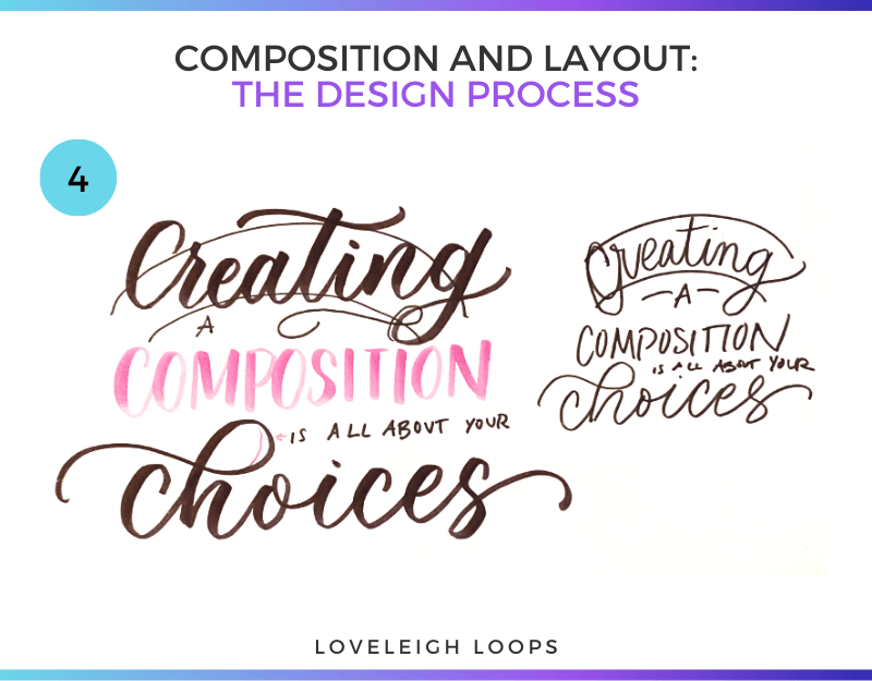
Your drafts don’t have to be fancy! Just get your ideas out and don’t be afraid to iterate
Finally, there was a slight absence of unity in the overall layout of the quote.
Rather than adding additional colors, Jillian chose to write the word composition in pink and fill up some of the space with decorative elements.
Let's look at the finished product. On this final image, you can see how each element contributes to the end result:

Do composition and layout feel more approachable now that you’ve seen behind the curtain?
You may also like: 7 Calligraphy Practice Prompts
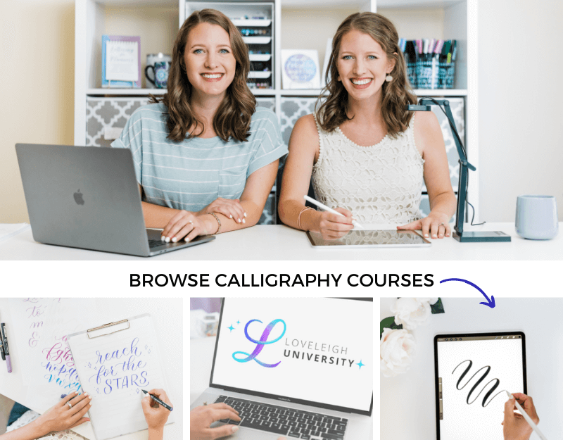
Calligraphy Courses
Whether it’s adding color, fixing an off-center design or playing with space, we hope you have your pen and paper out and are instantly seeing your designs improve.
We know you’re capable of executing your dream calligraphy and lettering compositions, and we're here to do it with you every step of the way.
If you're excited to learn calligraphy and hand lettering as quickly as possible, we have an online course tailored for each focus area.
For a series of workbooks, tutorials and guided exercises, get instant access to our courses:
Composition for Calligraphers
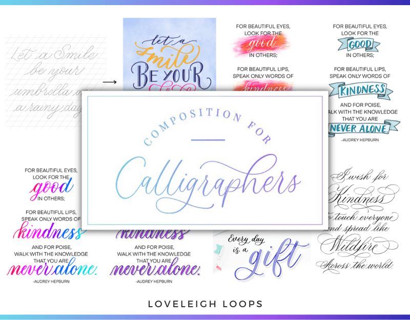
Click to learn more about Composition for Calligraphers
In Composition for Calligraphers, get instant access to:
Video lessons
A composition idea bank
Guided exercises
Quote prompts
Bite-sized lessons
A step-by-step process
Checklists to evaluate your work
Style Study Bootcamp
“This course blew my mind! I had no idea there was so much to learn about individual style. There’s so much to learn. Jillian & Jordan explain everything so clearly, step by step. I highly recommend it.” -Pam J.
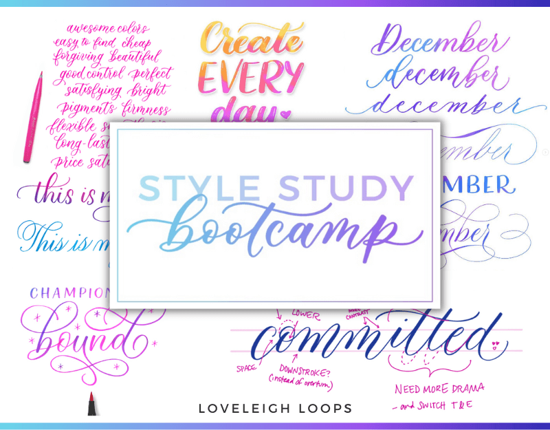
Click to learn more about Style Study Bootcamp
Sign up to Style Study Bootcamp for instant access to:
Video tutorials (5+ hours)
A practice workbook (80+ pages)
300+ examples to learn from
Templates for learning and practice
Letter Logic
“Letter Logic is invaluable to helping you get unstuck with your lettering. It's a PHENOMENAL value.” -Jessica C.

Click to learn more about Letter Logic
Inside Letter Logic, you get instant access to:
300+ letter variations with lowercase and uppercase letters
The exact framework we use for coming up with letter forms
An explanation of the logic behind creating new cohesive styles
We hope that this is just the beginning of our progress together! We have endless free resources on our website and YouTube channel. Make yourself at home here at Loveleigh Loops.