
How To Do Faux Calligraphy [Alphabet + Free Course]
Calligraphy is a beautiful craft that transforms your writing from looking normal to belonging on a greeting card or throw pillow.
While we feel that calligraphy is a skill that almost anyone can learn, we understand that buying special pens and learning the technique is something that you necessarily want to learn when you're first experimenting with lettering.
Enter: faux calligraphy.
Pin it for later!

Yes, you can learn how to FAKE calligraphy using just your normal cursive handwriting. Faux calligraphy lets you skip the learning curve and jump straight into the creative side of calligraphy.
If you want to make a one-off calligraphy project without needing rules and specialized pens, this faux calligraphy tutorial is perfect for you.

The faux calligraphy alphabet. We’ll show you how to write this letter by letter!
Rather than diving into the technical side of traditional or modern calligraphy, this hand lettering style lets you create gorgeous calligraphy without having to learn how to use special calligraphy pens.
Before we dive in... A big hello from Jordan (left) and Jillian (right). We're the twin sisters behind Loveleigh Loops and we're SO happy that you're here to learn faux calligraphy with us.
We've been teaching calligraphy and lettering for almost 10 years and have taught 40,000+ students in more than 150 countries. We're ecstatic to teach you, too.

Thank you so much for being here!
Let's dive into this tutorial so that you can learn how to “fake” calligraphy for yourself.
Table of Contents
What is faux calligraphy?
Faux calligraphy, AKA fake calligraphy, is a writing style that lets you create writing that looks like calligraphy look without needing special tools. While traditional calligraphy is normally done with a pointed pen and ink, faux calligraphy can be done with a pencil, regular pen, marker or ANY writing utensil.
Faux calligraphy can be based on your cursive handwriting or the basic calligraphy strokes.
What are the basic calligraphy strokes?
All calligraphy letter styles are built stroke-by-stroke, whereas cursive is written with uninterrupted lines. The calligraphy basic strokes are the individual letter pieces that make up calligraphy letters. There are two important things to know about the basic strokes:
Multiple basic strokes are used to build each letter. For example, instead of writing the letter "a" in one continuous motion, in calligraphy, it's written with 3 distinct strokes!
Strokes vary in thickness. Look closely, and you see that strokes contain both thin and thick lines.
Thin lines are called upstrokes, and thick lines are called downstrokes.
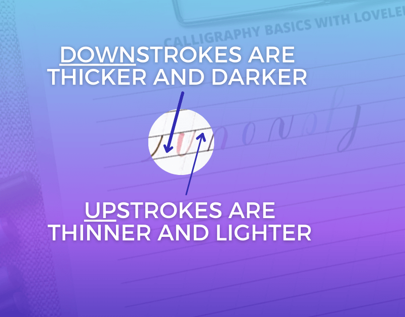
The thickness of a downstroke is sometimes called the shade. This background information will help you understand where to add shades to your faux calligraphy.
Knowing when and where to add shading to your letters is the key to turning your ordinary handwriting into beautiful lettering that looks like calligraphy.
Understanding the basic strokes lets you see where the thick down strokes are for each letter so that you can circle back and add shading later.
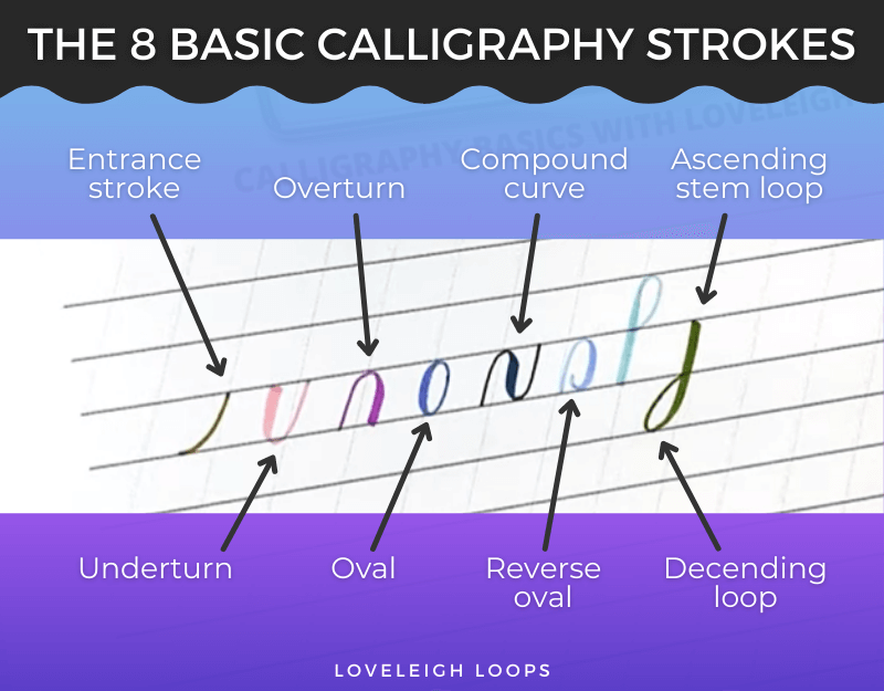
There are 8 strokes that the letters of the alphabet are created from.
Want to learn all of this in a step-by-step online course?
We've broken down this information into easy-to-follow modules with video tutorials and printable worksheets. Sign up now and get instant access to Faux Real Calligraphy:

What makes calligraphy different from normal writing?
When you learn how to write in school, you learn a writing style that balances speed with legibility. Ordinary handwriting tries to be as fast as you can while still being legible.
Calligraphy, on the other hand, is a completely different matter! True calligraphy is about beauty and getting as close to perfection as possible which means slowing down. Rather than writing words one at a time, calligraphy letters are built using the 8 basic calligraphy strokes.

Cursive handwriting

Calligraphy
When you learn calligraphy, you're working on building up the proper calligraphy technique that lets you create this beautiful art form. It's a slow and peaceful process that trades speed for beauty.
You may also like: Cursive versus Calligraphy
Is fake calligraphy cheating?
While faux calligraphy is technically not the same as true calligraphy, here at Loveleigh Loops we prefer to see it as the logical first step that beginners take.
It takes time to learn calligraphy and being creative is a large part of what makes learning calligraphy fun. Also, the creative side is why we practice this art form in the first place!

We’ll show you how to create this effect for yourself!
Rather than telling you that you're doing it “wrong”, we're much more interested in what you can do with your lettering skills. To us, faux calligraphy is like a little glimpse into the future; it shows the creative things you can do with lettering once you learn the proper skills.
You may also like: Basic Calligraphy Explained
Faux Calligraphy Technique
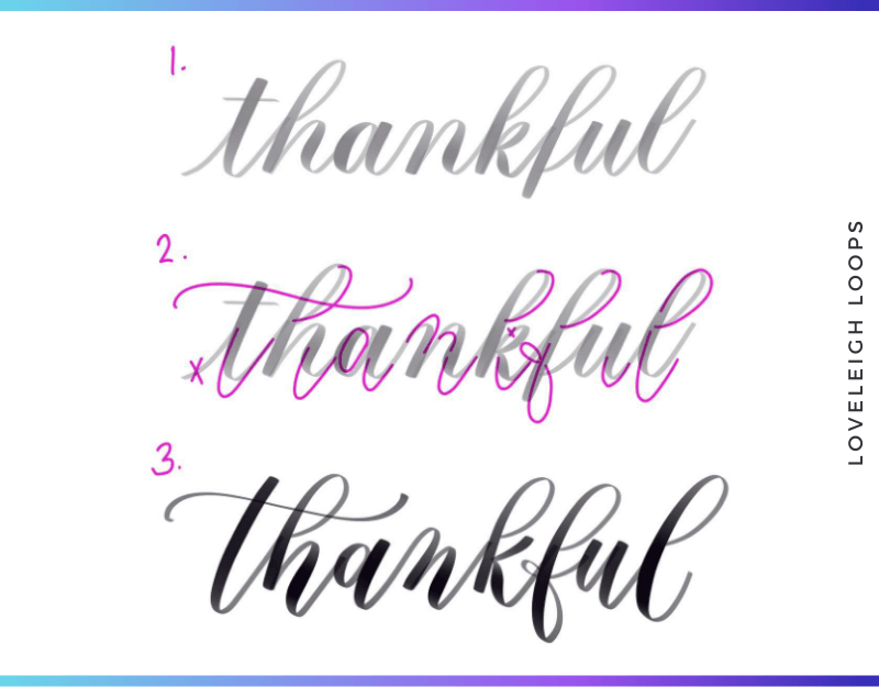
How do you create the faux calligraphy effect? The secret is manually adding shade to your letters.
What makes this different from normal calligraphy: A calligrapher spends a lot of time learning the pressure control of their pointed pen or brush pen. This pressure is what creates the thick part of letters.
In faux calligraphy, on the other hand, you write the letters first and come back after you write them to add thickness where needed, rather than the shade being added “automatically” by a calligraphy pen. See it in action here:

See where to add the shade? Required fields are marked with a downward triangle. Those are the downstrokes.
Let's get into what supplies you need to try this lettering style for yourself!
You may also like: How To Write “Thank You” In Calligraphy
Lettering Supplies
To do the basic strokes of true calligraphy, you need a special writing utensil. Traditional dip pen calligraphy requires a pointed pen and modern calligraphy is done with the flexible brush tip of brush pens.
Since faux calligraphy adds shading after you write your letters, you don't need a pressure-sensitive pen. In fact, faking calligraphy requires little more than just a pen!
A ballpoint pen, gel pen, fountain pen or even an ordinary pencil will do the job. These are all called "monoline pens" since these aren't pressure sensitive and therefore produce lines of a consistent thickness.
You can have a lot of fun with monoline pens. We even made an entire pen kit dedicated to faux calligraphy! You can check it out here: Loveleigh Loops faux calligraphy pen collection.
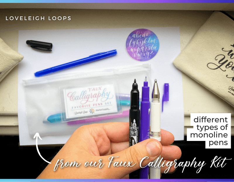
Our monoline pen kit
Consider using any of these writing utensils:
Monoline pen: Any normal pen will do for writing fake calligraphy
Pencil: Use a pencil that's easy to erase
Eraser: Your finished result will look a lot better if you can erase your unwanted pencil marks
Piece of paper: Where dip pen calligraphy requires special calligraphy paper, faux calligraphy can be done on any paper, even scraps of paper you have lying around at home!
Practice sheet: Practice sheets are essential for writing letters of the same height
Even in faux calligraphy, letters still need to be of identical height and written at the same angle in order the have the finished result look like calligraphy. This is why we recommend using one of our free worksheets.
Get your free practice sheet here in our Faux Real Calligraphy course.
How To Use Your Practice Sheets
One of the hallmarks of calligraphy is consistency between letter height, width and spacing. The goal is always* to write letters that look identical. You could even say that consistency is the most important thing in calligraphy. This is why using practice sheets is a must, even for fake calligraphy!
*This is important when you're learning calligraphy. Once you've learned the rules, you can break them. Bounce lettering is a great example of this:
If this is your first time working with practice sheets, the lines can be a little confusing. So let's very quickly go over them.
On every worksheet you can see a set of different lines:
Baseline: Every letter rests on this line
Header line: Also known as x-height, this line keeps letters equal height
Ascender: Keeps the ascending stem loops the same height
Descender: Does the same for descending loops
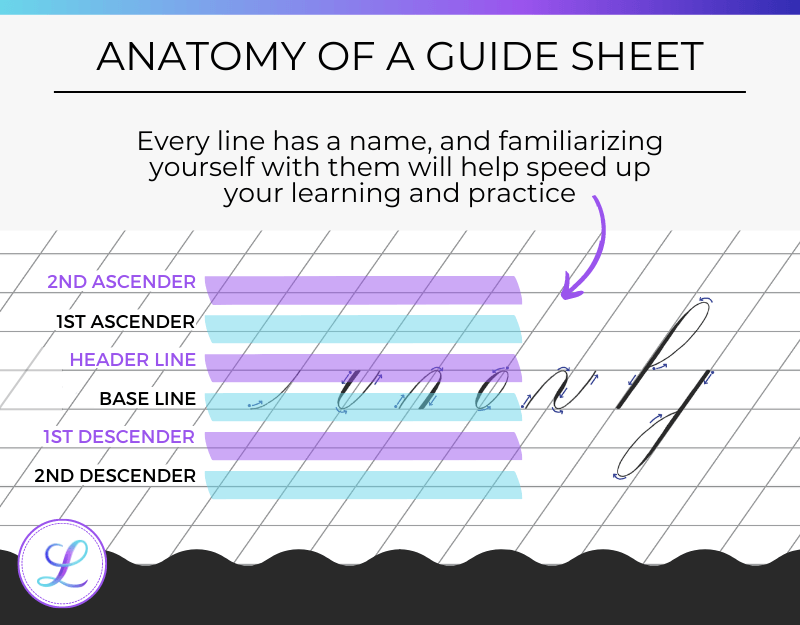
A guide sheet also contains slanted lines. These are there to help you write all your letters at the same slant angle.
So, now that we have our pen, our paper and are guide sheet, it's time to start writing!
How To Do Faux Calligraphy
There are 2 approaches to the faux calligraphy technique:
Add shade to cursive writing to make it look like calligraphy
Write the calligraphy strokes and manually add shade to downstrokes
Converting your cursive writing to faux calligraphy is easier to learn and faster to pick, so we're going to walk you through that technique first!
We've picked the lowercase letter j for this demo.
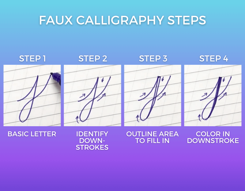
The 4 steps to turn cursive into faux calligraphy
Step 1: Write Letter In Cursive
Pick a letter that you'd like to write in faux calligraphy and write in on your practice sheet. Write it big enough that you have room to go in and add shade to each letter without it becoming difficult to read.
Even fake calligraphy needs to prioritize legibility!
Step 2: Find The Downstrokes
When you draw the letter, look for moments where you move the pen down the page (towards you). This is where the shade needs to be added to make it look like calligraphy.
As a quick reminder:
Up strokes (where your pen moves up the page) are thin lines
Down strokes (where your pen moves down the page) are thick lines
You're going to add shade (thickness) to every downstroke in your entire word.
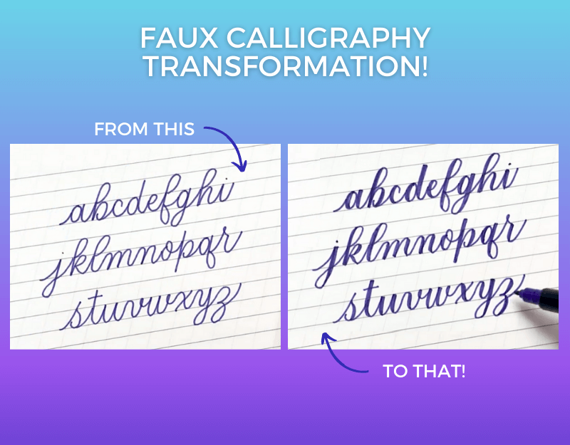
Alphabet before and after in faux calligraphy
Step 3: Outline Downstroke Area
Draw a line parallel to the downstroke areas of your letter--this is the area that you'll fill in to create the shade.
As a best practice, add this shade on the inside of your strokes so they don’t become too wide. There are exceptions to this that we'll show you in the letter-by-letter alphabet tutorial.
Warning: be careful here not to overdo it with the shading. Here's an example of what overshading can do to your lettering:

What happens when you overshade letters
When you outline your areas to be shaded, never shade beyond the halfway point for a given letter. Doing so leads to hand lettering that looks too bulky.
Step 4: Manually Add Thick Downstrokes
Now, take your pen and fill in the area that you've outlined! Besides just using a solid color to fill in your shaded areas, it can be fun to experiment with different colors and textures.
As a final step, erase any pencil marks that you left on the paper. And just like that, you've done your first faux calligraphy project!
This technique of turning your cursive into calligraphy is what we sometimes call "easy calligraphy," we even have an entire tutorial that explores this further: Easy Calligraphy Tutorial.
There's a more structured way to learn faux calligraphy, and we're going to walk you through this next with our alphabet tutorial.
Letter-By-Letter Alphabet Tutorial
Just like when you're learning modern calligraphy or traditional scripts like Copperplate or Spencerian, the very basics lie in understanding the way letters are formed.

We've broken the faux calligraphy alphabet down into letter groupings so that it's easier to follow along and go back to practice specific letters.
We have a video tutorial for every lettering grouping, as well as an introduction to this alphabet tutorial that covers the concepts we've taught you here in greater detail:
A, B, C
For every letter grouping, we've written out the strokes that are used to create each letter. This will help you learn the names of the strokes and make practicing easier!
Let's dive in with the letters a, b and c:
Lowercase letter a: Entrance stroke, oval, undeturn
Lowercase letter b: Entrance stroke, ascending stem loop, small underturn
Lowercase letter c: Entrance stroke, c-shape
D, E, F
Is your hand feeling stiff as you write these strokes? That's normal! While you may not vividly remember it, learning to write letters in school felt awkward as well.
Here are the letters d, e and f:
Lowercase letter d: Entrance stroke, oval, extended underturn
Lowercase letter e: Entrance stroke, e-shape
Lowercase letter f: Entrance stroke, ascending stem loop, exit stroke
G, H, I, J
If you're watching along, then you've noticed that there are multiple variations for some letters of the alphabet. Pick the variation that feels easiest for you to write as you're getting the hang of things.
Let's look at the letters g, h, i and j:
Lowercase letter g: Entrance stroke, oval, descending stem loop, exit stroke
Lowercase letter h: Entrance stroke, ascending stem loop, compound curve
Lowercase letter i: Entrance stroke, underturn, dot
Lowercase letter j: Entrance stroke, descending loop, exit stroke, dot
K, L, M, N
More than halfway through! Are you still writing along? Don’t worry too much about how your letterforms are looking at this moment-- you're succeeding just by repeating the strokes.
Here are the strokes that make up the letters k, l, m and n:
Lowercase letter k: Entrance stroke, ascending stem loop, loop, curve
Lowercase letter l: Entrance stroke, ascending stem loop (curve at the bottom), exit stroke
Lowercase letter m: Overturn, overturn, compound curve
Lowercase letter n: Overturn, compound curve
O, P, Q, R
If you're writing along with the videos, you should start to feel some of the muscle memory developing as you write these strokes over and over again. Keep writing and they'll keep feeling more natural!
On to the letters o, p, q and r:
Lowercase letter o: Entrance stroke, oval, small underturn
Lowercase letter p: Entrance stroke, straight downstroke, curve
Lowercase letter q: Entrance stroke, oval, descending stem loop (loop on opposite side), exit stroke
Lowercase letter r: Entrance stroke with small loop, short connecting line, underturn
S, T, U, V
We've arrived at the most difficult letter of the faux calligraphy alphabet: the letter s. Be extra patient with yourself and promise us that you won't over-critique how it looks. The letter s is still a little tricky for us, and we've been doing calligraphy for nearly 20 years.
Instead of perfection, focus on progress. Does each letter look slightly more uniform than the last?
Let's get into letters s, t, u and v:
Lowercase letter s: Entrance stroke with small loop, backwards c-shape, exit stroke
Lowercase letter t: Entrance stroke, extended underturn, t-crossbar
Lowercase letter u: Entrance stroke, underturn, underturn
Lowercase letter v: Compound curve, mini-underturn
W, X, Y, Z
You've made it! The end of the faux calligraphy lowercase alphabet. How much more natural do these strokes feel now versus your very first letters?
Your writing is going to get progressively more and more natural as you practice. Let's finish strong with the letters w, x, y and z:
Lowercase letter w: Entrance stroke, 2 underturns, small underturn
Lowercase letter x: Elongated compound curve, crossbar
Lowercase letter y: Compound curve, descending stem loop, exit stroke
Lowercase letter z: Adapted overturn, adapted descending stem loop, exit stroke
You may also like: 60+ Calligraphy Alphabet Examples
Capital Letters
The alphabet doesn't stop there, does it?! Onto the capital letters!
The basic strokes used in the uppercase letters are different than those we went over for the lowercase alphabet, but the same fundamentals apply.
See letters A, B, C and D here:
We're only going to show you the first 4 capital letters otherwise this blog post will get so long it needs its own zip code.
Don't worry though, we teach the entire faux uppercase alphabet in our free course: Faux Real Calligraphy.
Curious what traditional uppercase letters look like? See in our Copperplate Uppercase Alphabet Guide.
Numbers
The fundamentals of faux calligraphy apply the same to both letters and numbers! But, like the capitals, different strokes are used to build the numbers.
This is something that we love about calligraphy: the fundamentals take time to learn, but they lay the foundation to write any style that you want.
Here are the numbers written in faux lettering style:

Just as we walked you through every letter of the alphabet, we'll teach you how to write the numbers as well! Click to watch our numbers video tutorial on YouTube.
Having Fun With Your Alphabet
Trying out new faux calligraphy alphabets is so much fun and this is where the internet really shines! Just a quick search on Pinterest or Instagram will give you loads of faux calligraphy alphabet examples and inspiration to make the fundamentals FUN.
Speaking of which, are we connected on Pinterest? We share daily content across our social channels and would love to see you in the comments!
How To Practice Faux Calligraphy
Now that you've completed your first letter or word, it's time to practice, refine and improve your faux lettering. This all comes down to one thing: consistency.
Consistency is one of the core principles of calligraphy. Not only does every letter need to be identical in size and slant, but every shade needs to be of the same thickness, too. Practicing calligraphy is all about building muscle memory and there are no shortcuts other than repetition.
When you feel stuck, turn to this advice:
Use guide sheets
Slow down
Think about shapes and lines, not letters
Only focus on one individual thing at a time
These tips are from our blog post on how to refine your writing, check it out for more tips and advice.

You have the basics of calligraphy down. From here on, the only thing that separates your writing from anyone else's is practice! Here's some inspiration to help motivate you on your calligraphy journey
Faux Calligraphy Inspiration
Part of what calligraphy such a fun hobby is the large variety of scripts and styles that people have used over the years.
After getting inspired by a few different faux calligraphy styles, why not try your hand at coming up with your own style? Let these examples inspire you!
How To Transition To Normal Calligraphy
From the pointed pen and ink of traditional calligraphy to the brush pens of modern calligraphy, there's just so much to try and experiment with for yourself.
This faux calligraphy tutorial is a portal into a vibrant, rewarding hobby and we're so excited to help you every step of the way.
Memorizing the basic strokes and building up muscle memory for up strokes and down strokes is the hardest part of lettering.
With what you've learned here, you've already laid a foundation. You can keep practicing faux calligraphy, or you can move onto any style:
You may also like: The 5 Different Types Of Calligraphy
Free Faux Calligraphy Course
Are you having fun learning how to fake calligraphy? Let's take this new hobby (is it too soon to say the h-word?!) to the next level with our course: Faux Real Calligraphy.
Here you'll find even more video tutorials for writing the faux calligraphy alphabet as well as tons of free practice sheets that will lay a solid foundation.
Fun fact: out of all of the free worksheets and online calligraphy courses in our resource library, this is our most in-demand course! Come find out why students love it. Sign up now and get instant access.
Join Our Community
Do you have any follow-up comments or questions about learning faux calligraphy? Come ask them in our Facebook group!
We'll do our best to assist your calligraphy journey in any way. And even better than that... you're going to meet a bunch of new friends who share this hobby!
Why not join today and share a little intro to let us know where you live and why you decided to pick up lettering?
Next Steps
When you're completely new to the world of lettering, we know that hearing so many new terms and instructions can feel like a lot of material. We promise that it's all smooth sailing once you've learned the upstrokes and downstrokes!
Make yourself at home here at Loveleigh Loops and you'll see your lettering improve with every single practice session. This is the beginning of a beautiful journey, and we're SO excited to support you on it.
Happy lettering!